|
Good Grey |
| Submitted By fissure |
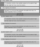
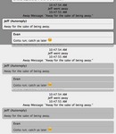
DescriptionMy take on what a good grey message style should be. unlike my other message style, I made this one almost completely from scratch and I'm happy to try to fix and bugs or make any improvements you might suggest.Update 1.1: - Added a separate style that includes contact names. - Took away the header Update 1.0: - Centered status messages - Changed 'footer' to a 'header' - Two new variations are added based on the finder toolbar buttons in Good Grey. One it 'detached' like the buttons really are, and the other uses a dark line to divide consecutive chat. CommentsYou can reply to individual comments by clicking the "Reply" link next to each. # by on 12/14/04 at 19:05:49awesome, but how did you get those really cool grey side scrolling bars?
# by on 12/14/04 at 21:36:48maybe a version without the header? other than that, it is awesome. thank you
# by andrew on 12/14/04 at 22:39:32Very nice...thought it looked pretty boring, but really nice and simple when you actually use it :) Good work!
# by magnitique on 12/15/04 at 06:13:56I agree... can you make one without the header? It's rather redundant as the name of the person you're chatting with is already present in the window title bar above and the tab bar below. The user icon is more or less not needed as it's so small anyways. Without the header, this would be an excellent and elegant minimalistic theme for the original graphite aqua and any other grey-based Shapeshifter skins.
# by on 12/17/04 at 23:59:26How about in-line icons, or one that's a tad larger than the top bar you have now? Not SUPER HUGE like a lot of themes that screw it up... but it's so small as to be useless right now. Otherwise the rest of the theme is fantastic
Post a New CommentYou must be logged in to post comments. |


# by on 12/12/04 at 00:37:45