
|
Crystal |
| Submitted By Josh Crang (Szilard) |
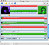
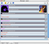
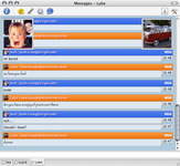
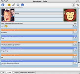
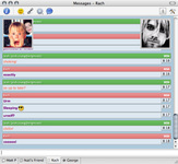
DescriptionA message style with full size icons in the top corners, also:This is my first message style made from scratch, please mail me with any bugs or improvements! ChangesVERSION 1.5: Added a graphite varient as requested by B_ko. The name headers now work better for names that take up more than one line. The blue header has been slighty modified to fit in better with the other headers. VERSION 1.7: Added orange varients. VERSION 2: Added a minimal version due to many people complaining on the style being too colorful!! VERSION 2.1: Modified the info.plist file so it works with Adium 0.8. VERSION 2.5: Added support for message background colors. CommentsYou can reply to individual comments by clicking the "Reply" link next to each. # by on 11/10/04 at 22:47:30Nice Idea.. works great. Perhaps some more less bright colors. like graphite, gray etc. I like the big pictures above and I think its not nessecery to ass the tiny ones too.
great job # by ColdFlame87 on 11/15/04 at 01:19:41may i suggest one without the big icons floating as well, thankyou
# by on 11/15/04 at 05:21:35One problem: The default icon is 96x96, but AIM icons are smaller, so if the person starts off with the default icon and then has an icon retrieved, it overlays improperly.
# by Szilard on 11/15/04 at 14:47:03Evan: I know of this problem but i don't think it can be fixed and still have the icons update, and change when hovering over names, if anyone knows of anyway i could i'd like to know!
ColdFlame: I'm going to make a website with further varients on my themes so i dont end up with loads of different ones on the version on the x(tras) site, the website should be finished soon. If anyone else has any ideas i'll be happy to make them! # by Scottish on 11/16/04 at 19:18:40I would humbly request some variants with slightly more... subdued colors.
# by on 11/29/04 at 08:46:14LOVE IT !!!!!! thats all Adium needed.
Now the only thing that bothers me about Adium is the fact that I cant see Peoples 'status' if there set to 'Busy' Using MSN messenger. i agree, Perhaps some light colors would work good, maybe putting both pictures to the right of the screen whould look cool too because most Msgs are short and to the left of the screen. # by on 11/30/04 at 05:00:54I think that the Large pictures would look best onlot of the 'minimal' syle that came with Adium, I find all the boxes and colours very distracting and makes it look cluttered and busy. It makes it hard to read and thats the whole reason i have the software. # by Szilard on 11/30/04 at 15:17:28The problem of people finding it too colorful seems to appear a lot so i've decided i will add a more subdued version with the next version of crystal, as for the large pictures with the minimal i'll try and add them in and put it on my website! Should be ready soon.
# by macfan26 on 12/23/04 at 03:41:22Very awesome style, I'll be sticking with this one for a while :)
# by on 01/06/05 at 19:10:00I like it, but is there a way to eliminate the two great big grey Adium icons in the msg window? I find their presence a bit distracting. Thanks.
# by Szilard on 01/06/05 at 21:32:58You can hide the large icons by ctrl clicking on the message style file then going "Show Package Contents" then Contents/Resources/Bass.css. Change height and width to "0px" and border to "none" under "div#send p .buddyout", "div#send p:hover .buddy2" and "div#send p .buddy" this should remove the large icons :).
# by on 01/27/05 at 21:06:40hey, I've been looking around for that perfect message style, and yours come real close. I LOVE how the icon display its size according to different client. like 96x96 in MSN and 48x48 in AIM. that's really good!!! and i like the smaller icons showing in the conversation too.
however, may i add a few suggestions? such as can you incorporate graphite into other color combinations? such as "graphite and blue" or "graphite and red"... etc. and can you add a fading color tune to the background as well? that would be awesome. # by on 03/24/05 at 22:21:50Just FYI, if you ever add support for %textbackgroundcolor%, to your message style, it's one of the better ones with it.
# by on 03/28/05 at 03:13:55hey i have adium however when it comes to downloading message styles, they aren't supported by jaguar in 10.2.7
all other extras work fine Post a New CommentYou must be logged in to post comments. |





# by drunkenlink on 11/05/04 at 03:39:52