|
Prologue |
| Submitted By Jonathan Bailey (Bailey) |
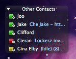
DescriptionShiny, bevelled squares with 'pixel scale' status notifiers. These look good with dark, space saving and minimalist contact list themes. I recommend 'MochaStyle' by Mocha0range, Decay 2.0 by Boramor (Included with Adium) and Pro Dark by Jumpei (In Preview Image)**Please comment if you enjoy it!** Images   CommentsYou can reply to individual comments by clicking the "Reply" link next to each. # by Crystalmyst on 10/29/09 at 23:53:39Love the look on dark themes, but why not do a version for light themes too?
I think with a little bit of work, this could be so much better! Thanks for it though, voted, and will keep it in my Adium for when I decide to make a new dark theme :) ~Tim # by mistermagooey on 02/05/10 at 06:50:15What's the point of the status icon if the individual squares are colored? You cant even see what the little image in the corner is.
Also, the yellow 'idle' one is too dark and quite ugly. Other than that, nice. Just not clean at all Post a New CommentYou must be logged in to post comments. |


# by Chaos on 08/30/09 at 19:19:41
5 Ducks ;)