|
Silverstone |
| Submitted By Adriano Manocchia (SalsaShark) |
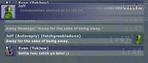
DescriptionMostly an exercise to become familiar with Adium theming. It uses elements from Chameleon and Mockie, but was almost completely rewritten. No variants.Version 1.0.1: Updated to fix lack of scrolling with status changes. ImagesCommentsYou can reply to individual comments by clicking the "Reply" link next to each. # by jbuk on 05/14/04 at 14:46:14i like the look of this style but its just to dark for me. i would like to change the fonts and change the background in the Adium prefs.
If it could be customised then i think i would give it a whirl. I do love the timestamping btw!!!! # by on 05/14/04 at 15:32:37Well, either you make a dark theme with light text or a light theme with dark text. If it's in the middle, the text tends to not have enough contrast. So yeah, this was definitely intended as a dark theme. But like I said, it was just to get familiar with the process. I plan on making some original themes that will probably draw from some design elements like the timestamps, so keep an eye out for those. =]
# by on 05/14/04 at 15:34:19Also, please note that a bug in 0.56 results in the text not showing up white, as in the preview. Hopefully this will be fixed in the next release.
# by on 11/06/04 at 21:41:21Aha - finally found a style that shows the person's icon in one spot! Any chance of being able to remove the icon at the beginning and end of each line? (If its at the top of the window, I don't really need it on every line unless more than one person's chatting...)
Post a New CommentYou must be logged in to post comments. |


# by mnkeybsness on 05/14/04 at 13:57:21