|
HugoHUD |
| Submitted By Hugo Ahlberg (hugoahlberg) |
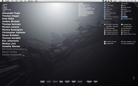
DescriptionHugoHUDA minimalist theme with focus on typography and "keep it simple". When I started my new work, it was a very handy way of learning all the names of my colleagues function/form :) Due to popular demand (at work/friends) I've decided to release it. It's my first Adium theme ever so consider it a beta release. Anyway. Feedback or suggestions are much appreciated. And the now obligatory; follow me on Twitter for updates: http://twitter.com/hugoahlberg INSTRUCTIONS Just double click both files to install them, then go Adium> Preferences > Appearance > Contact List: and select HugoHUD under both Color Theme and List Layout. Below those are some settings I highly recommend for best results:
And finally, in Adium> Preferences > Advanced > Contact List:
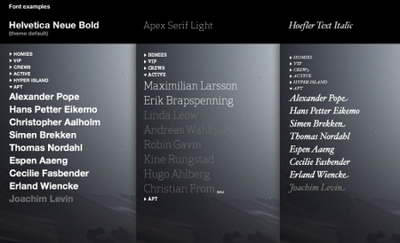
NOTES The font in the screenshot is Gotham by Hoefler & Frere-Jones which is not included, but you can change it into whatever you want in Adium > Presences > Appearance > List Layout > Contact Font In true minimalist form I have removed all icons, but user icons and what not is available on mouse over. And I'm using color coding instead of icons to display statuses. The default color settings works best on dark background, but obviously you can just invert the font color if you have a light wallpaper. Think thats about it. Enjoy! Hugo Ahlberg --
CommentsYou can reply to individual comments by clicking the "Reply" link next to each. # by hugoahlberg on 06/22/09 at 12:01:21Thanks!
About the dock. I made it myself, inspired by someone else's work who also made text based icons (cant find the link!). So far I have only made icons for the applications I use myself (which isn't many). To release them I would have to make a whole set, which I might do in the future. I'll let you know! :) # by raptor888 on 06/28/09 at 12:46:30Woa, this style looks very kewl with my wallpaper, btw, your dock is really great, i will expecting that set that you talked about :O:O:O, anyway thks! for the CL Style.
# by hugoahlberg on 07/02/09 at 23:24:53Glad to hear! If/when I release the icon set (HugoHUDock, clever hu? ;) I'll update this page and via twitter.com/hugoahlberg
Cheers! hugo ahlberg # by fo0tprintz on 09/12/09 at 06:45:07this looks great! been using it since your release.
do you have a message style that you use too? i like the minimalism of the contact list and want to bring that over to the message window :) # by werdnanoslen on 11/15/09 at 11:28:52Downloaded, but using billieBarred font @ size 9. It all looks great! Also, I'd really like to know how you've done the text icons in your dock.
Post a New CommentYou must be logged in to post comments. |


# by ernes28 on 06/18/09 at 05:07:27
# by hugoahlberg on 07/02/09 at 23:21:00
About the dock. I made it myself, inspired by someone else's work who also made text based icons (cant find the link!). So far I have only made icons for the applications I use myself (which isn't many). To release them I would have to make a whole set, which I might do in the future. I'll let you know! :)