|
Outlines |
| Submitted By BlueRevolution |
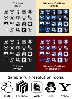
DescriptionThese icons were originally created to go with my intrigueBlue list theme, but I've kept on using them even after growing tired of that theme, so I thought people might appreciate an independent release. I have been using the transparent variant with Morpheus for a very long time, and find it goes very well.This set has gone over a year without an update, but with all of the hubbub surrounding Adium 1.4, I figured I'd better dust it off and give it a good overhaul. Hope you like the product. As requested, I've also added a matching status icon set. Changes
Images CommentsYou can reply to individual comments by clicking the "Reply" link next to each. # by Chais on 11/28/08 at 17:13:24meh... they don't work for trensparent contact lists (like HUD) because there's always a slightly visible frame around the icons. but if you fix i'll use it :D
apart from that, i love the look # by BlueRevolution on 10/23/09 at 03:48:48Not anymore! The glow algorithm used in 2.0 shouldn't bleed past the edges of the images.
# by westcoast021 on 07/21/09 at 16:45:58very nice...an updated version for 2009 would be amazing, as well as a matching status icons if possible? :D either way, good work. love the idea of transparency.
# by BlueRevolution on 10/24/09 at 14:42:10Sorry, I guess the comment system strips HTML tags. You can grab the status icon set here:
http://adiumxtras.com/index.php?a=xtr...tra_id=7124 Post a New CommentYou must be logged in to post comments. |


# by kaze on 06/15/08 at 04:40:31