|
Simply Smooth |
| Submitted By Aqueous |
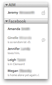
DescriptionThis was originally the Smooth Operator message style, but there were some things about it that I personally didn't like, so I took it into my own hands, and well..this is what you get.*NEW* Fonts are more readable and darker. Changed fonts to Myriad Pro. Message style now displays consecutive messages with separations Now able to change font color as desired Changes1.0.4 Initial messages being too low has now been fixed. Prior fix only fixed for certain users. 1.0.3 Removed "Normal" variant as it was a duplicate of "Orange and Blue", which is now the default variant. Sender names are a little larger Status containers now only show the actual status, not the status message itself. AM/PM are now am/pm for initial time of messages 1.0.1 Added newer contact list theme/layout 1.0 Removed Contact List Theme/Layout. Fixed initial messages from appearing too low. 0.6 Removed message style with icons. Fonts are now more readable. Overflow issue should now be fixed. 0.5 Added additional style that has no user icons and the other with user icons. My CSS skills are lacking, so that's the only way I knew how to do it. I also shortened the header down to about 20px since the initial one was quite large in my opinion. 0.4.7 Added simple header with just chat/user name. Cleaned up some code/unused files. 0.4.5 Now able to toggle user icons on/off. Lightened up message text and time stamp. Centered the status message more evenly between messages. 0.4 Added many many more variants and cleaned up some of the code as well. 0.3.1 Changed name to "Simply Smooth" and updated the name throughout the message style itself. The list layout/theme use to appear as "Mac OS X", and now appear as they should. 0.3 Added matching contact list style and theme. 0.2 Added several variants. 0.1 Initial Release CommentsYou can reply to individual comments by clicking the "Reply" link next to each. # by Lillebakken on 03/25/07 at 15:13:57Minimalistic and simple. Just the way I like them. Too much crap on most other ones.
Well done sir! # by zazzakakashi on 07/16/07 at 17:30:07Hi, great message style!! I cant wait to see the future release with the icons.
I was wondering if this wass only happening to me but...When contacts have very ling screename, it overlaps on the first line of what they say. I think the only way to work around that is to stretch the window to fit the size of the screename? but other than that, this style is killer! # by Aqueous on 07/16/07 at 21:33:45I have never had that problem. My suggestion would be to either stretch the window as you said, or use an alias for the long screen names. If you do that, you shouldn't have any problems.
# by mathuaerknedam on 08/08/08 at 01:31:13Add the following to .sender
text-overflow: ellipsis; overflow: hidden; white-space: nowrap; A long sender will still overlap the time, but it will stay on a single line and use ellipsis to indicate then it's being truncated. # by zazzakakashi on 07/24/07 at 10:32:19yeah that's what i figured, it's minor problem anyway, the rest is all working perfect !! So happy on the new release with the icon and the header!!!! This style rocks!
# by Beaeuge on 09/15/07 at 14:00:54hi... i havent downloaded it yet so my question might be answered once i do but... can you change the colors... instead of just white?? or put in pictures for the background... just wanting to know... great job though thanks
# by Aqueous on 09/15/07 at 17:44:10You cannot change the colors of the message "bubbles", but you can change the background to whatever you wish. I was going to add different color message bubbles, but it would've been too tedious and i just didn't feel like doing all that work. Anyone else is free to give it a shot though.
# by jodermc on 12/17/07 at 00:40:44i absolutely love this message style, but there is just one problem: i have a hard time reading the messages, and when i try to change the color of the font to make it darker, it works for one post and thats it. could you make it so that the font changes will stay permanent until you change then again? thanks.
Post a New CommentYou must be logged in to post comments. |


# by BlackandWhitePenguin on 02/26/07 at 04:37:45
# by Aqueous on 02/26/07 at 16:01:21
# by tasmanian_devil on 05/12/07 at 13:05:45