|
Negative |
| Submitted By Paul Armstrong (mnkeybsness) |
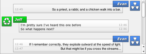
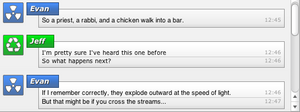
DescriptionThe original point was to make something that was clean and simple but still attractive to look at for long periods of time. I have included different default buddy icons inside the set. Just move the icons into the incoming and outgoing folders that you want to use and rename them to "buddy_icon.png". Select Use Contact User Icons to see the style-specific icons.Variants with the word Custom after them are meant to be used with user-specific buddy icons. Deselect Use Contact User Icons to see custom icons. CommentsYou can reply to individual comments by clicking the "Reply" link next to each. # by Bluemilker on 06/03/04 at 22:18:33I love it, except for one thing: until there's a scrollbar in a chat, the bottom chunk of the last message is lopped off. Any idea why?
# by mnkeybsness on 06/03/04 at 22:43:06Bluemilker and everyone else:
The message cutoff is a known issue with the Adium Webkit responding to complex CSS. I'm sorry, but there is nothing that I can do at this time to fix it. # by Citadel712 on 06/04/04 at 23:01:07Something you can do to prevent the cutoff is to change the message display history so that when you start an IM it already has enough lines to create a scrollbar. IMO, this is less annoying than the cutoff.
# by Mike S. on 06/05/04 at 16:55:49I really like the design of this message view and I'd love to use it but it doesn't seem to be accepting any changes in fonts or sizes set from within Adium. I've closed the message window and restart the app but those fonts won't change.
As it is, the message text is just too small to be comfortable. # by on 06/05/04 at 19:50:04Mike: I will look into why it is not accepting font sizes. I have seen it accept font colors, so I don't know what the problem would be.
# by Ders on 06/06/04 at 14:57:51I love it. Is it possible to get it to accept font backgrounds, or is that not in webkit?
# by on 06/06/04 at 16:16:28FANTASTIC message view! I absolutely love this one. I know you mentioned it above, but I am hardcore getting that error where the text is cut off until a scroll bar appears. Do the devs know about it? This is the only message view I experience the bug on.
# by on 10/20/04 at 06:12:27i absolutely love the layout and design of this msg view...only thing i wish is that there was a slightly transparent version that could be used with custom backgrounds!
# by greenfeet on 11/07/04 at 18:33:38hey its cool but do any of you know how to make the font colors show? mine never do and sucks, plus that font thing would be nice as this style has a cool design! thanx much.
# by Craig on 05/17/05 at 16:28:09Thanks for creating such a great message view! For some reason on mine, when I open a new message and it displays the previous messages history, part of it is cut off at the bottom and there is no way to scroll. I am using 10.3.9 if that helps.
Thanks again! # by cupton on 05/17/05 at 19:06:22Sorry, I did not notice the other posts at the top about the cut off on the history... Please disregard my previous post.
Thanks! # by Akurin on 10/02/05 at 18:27:31how did u get the scroll bar to look white like that? with shapeshifter? and if so where can i find the theme?
Post a New CommentYou must be logged in to post comments. |


# by Tarambana on 06/03/04 at 21:18:31
Thanks