|
Black Is Beautiful |
| Submitted By Lode Vanhove (Lode) |
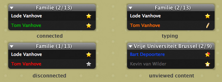
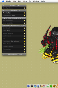
DescriptionI was a bit disappointed in most of the Contact List Styles, so I decided to make my own.I made it a rather dark Contact List Style so that I was able to visually enhance certain events: - online contacts are bright white - away/idle contacts have a softer gray color - events suchs as connected/disconnected/typing/unviewed content... have their own nice color - status icons are clearly visible Other things I kept an eye on: - readable, yet small font - whitespace - group bubbles for the win! :D I didn't want any user icons to break the consistent look, you can add them yourself if you want to. Any suggestions are welcome! I hope you enjoy it as much as I do! CommentsYou can reply to individual comments by clicking the "Reply" link next to each. # by Lode on 02/01/06 at 18:50:33Thx for the comments so far!
@Tipo I myself prefer not to make it any smaller because there is already a distinction on color, but everyone is free to adjust the theme ofcourse :) # by ispytonyv on 03/22/06 at 20:31:59great work... agreed about the status text, but that's an easy enough change to make
# by Batshua on 05/21/06 at 21:20:40Could you make a message style to match?
I love Black is Beautiful, but I'm having trouble finding a message style that goes well with it. # by lolamione on 06/23/06 at 12:18:10This is my absolute favourite! It's so clean looking & sleek. Thanks so much, you did a great job!
# by lanky on 07/05/06 at 00:10:32i still cant find a message style that i like for this, though i really like the style. if you could make a message style that matches, that would be great.
# by suneet on 07/07/06 at 18:02:31Got to join the petition here. I only started using Adium yesterday and found my way to this site whilst exploring its menu options. After about the first 10 mins of use I was considering uninstalling it and returning back to MSN's official mac client. That was until I found "Black is Beautiful" and the adium dock icon set with the macbooks/powerbooks. It's changed my life completely! Well, slight exaggeration, but it is open on my desktop 24/7 which MSN Messenger never was.
Anyhoo, like I said, I have to join the petition. Please could you make a matching message window style? I can't find any to fit :( # by suneet on 07/07/06 at 18:12:23I've done some more searching and came up with a close match although (the white text input field makes it look a tiny bit odd). Try installing the Dark CF message style and changing the background (by checking "use custom background" to Apples "Tungsten" colour, selected from the crayons. It's as close to the contact list as my limited (extremely crap) expertise can provide.
# by Daniel on 12/16/06 at 10:06:29Beautiful indeed! Great message style for many themes and configurations. :) Thanks!
# by Krafty on 02/25/07 at 21:45:02You should really consider making a separate message style with the same look
# by TheMuffinMan21 on 07/03/07 at 05:14:58i like it. its easy to use and easy to understand. nothing can come close to how easy this contact list format is used.
# by kingscooty on 01/27/08 at 14:31:45I've found a little bug. The name alert that appears above the dock icon when you receive a message is faded out blue colour (and not white like it should be) . Is there anyway to fix this?
I love the skin by the way! Post a New CommentYou must be logged in to post comments. |


# by 61Tipo61 on 02/01/06 at 11:30:32