|
blank |
| Submitted By gethen |
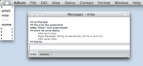
DescriptionBlank tabs. If there's another way to do it, I can't find it.Try with "Zero" message style for a minimal, blank, colorless experience. Or as my friends would call it, "clean, uncluttered, and simple." Use the cmd-w shortcut to close tabs. cheers. ImagesCommentsYou can reply to individual comments by clicking the "Reply" link next to each. # by Félix on 09/11/05 at 17:54:08Well it is my opinion that a 16x16 image doesn't take that much space for the benefit to know if your contacts are away/idle/available.
# by gethen on 09/13/05 at 21:19:26while i personally use status icons, this was requested by enough of my adium-using friends that i decided to share it with anyone who would like it. sharing work, providing choice, what's not to like?
# by Bosk on 09/16/05 at 13:05:07do you have to use cmd-w to close tabs then, since there's nothing to click?
# by gethen on 09/18/05 at 23:03:41Bosk: An excellent point that I thoughtlessly failed to mention, thank you. I will add it to the description.
# by ianlafo on 09/24/05 at 02:08:00I personally really like this. I personally like have status icons to use, but I'm always a fan of cutting down on the clutter. I can use the dock icon and the status menu icon to show when and what people are talking to me. I would use this, but again, I really like the execution and idea.
# by Randall311 on 01/04/06 at 17:49:04I like it! Does anybody know if you can change the text color of the username in the tab depending on what they're doing. Like with gaim, they use green as the tab text when somebody is typing, yellow when they've stopped typing, and red when they've sent you a message. if you could do that rather then change the satus icons, it would be ideal. (since there are no status icons in this theme)
Post a New CommentYou must be logged in to post comments. |


# by Xianghua on 09/08/05 at 20:00:02