|
|
iChat Complete |
| Submitted By Jesse Hattabaugh (simpolman) |
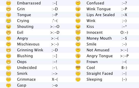
DescriptionI realize there are several iChat emoticon sets out there already. I wasn't satisfied with those sets, so I made my own. I believe you shouldn't have to use a menu to use emoticons. So these icons attempt to be simple, with no more icons than you can, or already, use, while at the same time complete, with all the icons that you will use. They are also true to the look of the text that they represent so that you see what your friends see.Images CommentsYou can reply to individual comments by clicking the "Reply" link next to each. # by Xanadu on 02/23/05 at 18:54:23Simply open the archive you downloaded and double click on the file that's extracted. Adium should already be its helper application and will install it.
# by canadia on 04/19/06 at 16:48:17Does this include all the extra stuff you get if you have a .mac account? I have all the files as jpgs but im not sure how I install them or what to do with them! But I can send them to someone if they know what to do....
# by Corny on 06/07/06 at 15:07:31Great! They are really fitting, pretty and useful - I like it that they are very close to the raw character combinations. 5 Ducks!
# by tasmanian_devil on 04/22/07 at 04:36:13these are cool! I like iChat but adium is better and I wanted these since forever!!
# by tgos on 03/13/08 at 09:28:17First of all the positive things:
1) You have almost every smiley I know in your list, congratulations, great work! 2) Your smiley images match the "text image" of the smiley better than every other theme I found so far. Congratulations again, great work! Actually I love your theme, but I don't use it out of one reason: The smileys are so pale! They have so little contrast (especially the mimic could be drawn closer to black, it should be much darker). I theme that can show you how a good contrast looks like is Adiumicons, http://www.adiumxtras.com/index.php?a...tra_id=1706 ). Compare your ones with these on the same screen with the same chat backround. While Adiumicons are always readable, always good contrast, regardless of background, your ones look pretty pale on most backgrounds, they seem a bit smaller and it's hard to see the mimic if the monitor has bad contrast or brightness, as the contrast of the mimic to the rest of the face is too low, just like the surrounding line of the smiley. Maybe you can enhance that, that would be great! Thanks. Post a New CommentYou must be logged in to post comments. |


# by on 12/19/04 at 18:58:21