|
ProtoScroll |
| Submitted By Eoban Binder (eobanb) |
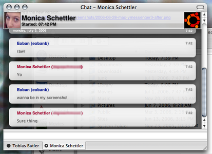
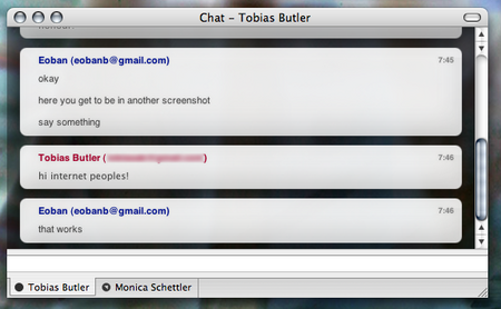
DescriptionThis is the ORIGINAL ProtoScroll, and it is intended to be a soft and elegant message view theme, somewhat based on Smooth Operator. However, it is slightly more space-efficient; both your own icon and your friend's icon (if you're using a protocol with icons) will appear on the left and right sides of the translucent top bar, rather than in the main conversation itself.Features of this theme: iChat and Proteus-like Smooth scrolling with each message, via JavaScript Links change colour on mouse rollover Shadows under non-conversation text. Top bar is optional. Fonts are changeable. I tried to check this as carefully as I could for bugs, and the code is still a little bloated, as this is still at 0.2. There may be lingering bugs. This is mostly to demonstrate that Adium can indeed do smooth-scrolling like Proteus and iChat can. Feedback welcome; enjoy! --Eoban ChangesReady for Adium 1.0!CommentsYou can reply to individual comments by clicking the "Reply" link next to each. # by macaddct1984 on 12/08/04 at 00:34:26# by on 12/08/04 at 03:30:07Great msg view! I would have liked the name of the chat to be sans-serif though as an option, to match the chat better.
Please keep working on this one! the more options the better, as this is my new favorite one. # by Nooon on 12/08/04 at 13:31:23Great message style! Not to keen about the h1-font though, so I changed it :)
But other than that - GREAT! # by whiteangel on 12/08/04 at 15:16:59Love it! Great work ! Looking forward to further improvements!
# by mathuaerknedam on 12/08/04 at 15:27:26Cool! Can you make it so that new messages smoothly scroll up even when there isn't a scroll bar?
# by eobanb on 12/08/04 at 18:59:36Thanks for the comments, everyone. Regarding mathuaerkneam's inquiry about scrolling at the very beginnings of conversations: this is possible, but it is not practical, because I would need to "force" the scrolling. The main problem with doing this is that if you have scrolled up to look at some earlier part of the conversation, if the other party sends you a message, it will scroll back down whether you like it or not. If this is confusing, try it with some themes in Proteus that use a very similar script; you're reading an earlier message, and all of a sudden you're interrupted. It's really annoying.
I believe I could fix this by adding some whitespace at the beginning, so the Javascript "thinks" there's already a conversation going. If anyone has ideas just email me or something. To do: It looks like there's a minor display bug with long away messages; I'll fix that in the next release. Also, it looks like people want some choice as to what font to use for the name of the person you're talking to, so I'll have a few choices for that in the next release also. Again, thanks for the comments! # by on 12/08/04 at 22:14:41Very suave, though it would be nice to have different varients with more color.
# by nick on 12/09/04 at 01:42:07my problem: the away msg bubble does not expand when the message is more than 1 line long...
# by macaddct1984 on 12/09/04 at 06:59:53Nick (and I believe it's what you were referring to eobanb), that bug is not a problem with the message view, it's with Adium itself. All views which have an enclosure around the away message just don't expand around it... at least I'm pretty sure this is the case.
# by dzhim on 12/09/04 at 23:10:19No, it is a problem with the individual message view(s). It's just a common one since some authors don't think to check for long status messages.
# by Iceduck on 12/10/04 at 12:22:05I agree that this messagestyle rocks, but I also dislike the font used in the header. I've changed it to Lucida Grande.
# by mathuaerknedam on 12/10/04 at 16:34:32Can't the header just use the same typeface as the rest of the text (allowing the user to change it in prefs)? I've implemented a header in the styles I've written, so for all I know there's something special about text there.
# by mathuaerknedam on 12/10/04 at 23:54:44Oops! I meant to say that I've *not* implemented a header...
# by Anonymous on 12/13/04 at 02:46:29awesome style
pardon me but i don't know how to change the header font, can someone help me with that? # by Anonymous on 12/22/04 at 17:32:51cool except that the pictures dont update when they are changed by me or the other user.
# by on 12/23/04 at 23:27:54Nice job, looks clean works great. but will be better if there were diff versions with colors and perhabs diff avatar sizes.
this one is too small # by on 12/28/04 at 12:52:00Is there anyway to remove the scrolling thing? I love the style, but the scrolling runs annoying slow when other things are happening on my poor little iBook. :)
# by on 01/04/05 at 20:15:32It's not scrolling for me. Is that weird? I just downloaded the latest version of Adium and still no-go. Is there something, some setting I need to change? When I or my friends type to me, the window doesn't scroll at all. I have to manually scroll it to see anything new. Help?
# by on 01/16/05 at 18:41:51This is most definately my favorite out of all the message view styles. Thanks!
# by telic.detour on 01/24/05 at 06:08:56Very nice. Something wierd is going on beside the compounded incoming history bubbles though -- to the left of the chevrons is what looks like a partial time-stamp, except it's half inside, hald outside of the box, and too similar to the background in colouring to be able to see.
# by galbis on 02/16/05 at 06:22:05this is absolutely gorgeous..the scrolling is so nice! I agree with whoever said Sans-Serif for the title would be a nice option.
# by eobanb on 04/20/05 at 21:14:28No, I'm afraid Proteus does not have a fix. You see, the actual scrolling is the responsibility of the messageview, not the client. There isn't really anything Proteus itself can do. As for smooth-scrolling messageviews in Proteus, their only "fix" has been to remove the smooth scrolling feature. I'm not really willing to update ProtoScroll until I figure out a way to keep smooth scrolling, because that's the whole point of this messageview.
# by zaudragon on 04/24/05 at 15:05:09Anonymous: Yes you are right. Proton had a fix in the forums, and I used it.
The thing was, the fix was specific to a few message styles, so I had to go through the whole Smooth Scrolling script and var a bunch of variables. Use my fixed script from ProtoScroll 2.1! # by zaudragon on 04/25/05 at 06:05:00Heh, well you used Adium's :D
And you combined it with Proteus's Message Style's In the end, we all get credit ;) # by on 06/22/05 at 14:26:12Is there a way to truncate the alias inside the window?
I don't know in other countries, but here in Mexico, some guys like these huge names that are annoying...Thanx # by miroku on 10/05/05 at 16:18:11Oh and in reference to zurdo... Yes... My friend's name covers up the text... it shows as 3 lines... please fix!
# by alexks3 on 07/04/06 at 12:21:02hey, looks like a very nice message style, but how do you get a transparent background like the sample above?
# by eobanb on 07/05/06 at 15:34:06alexks3, you need to be using Adium 1.0b1 or higher. Then just go into Preferences, Messages, select ProtoScroll (or another style that supports transparency, check the Use custom background box, and then click on the Color box. Lastly, drag the Opacity slider to a desired value (say, 60%), and you're done.
Post a New CommentYou must be logged in to post comments. |


# by macaddct1984 on 12/07/04 at 22:57:40
Other than that it seems pretty much like Smooth Operator.
Great job.