|
Windows |
| Submitted By Joe Walsh (joein3d) |
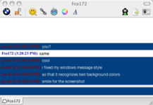
DescriptionDo you remember a time when AIM convos were simple and easy to copy and paste to people? Pepperidge Farm remembers.This new version sees background colors and turns off "combine consecutive messages" by default. Looks like windows right out of the box. ImagesCommentsYou can reply to individual comments by clicking the "Reply" link next to each. # by Victim Duck on 11/10/04 at 12:57:29My english is not very good,sory ('cause I'm french, lol.
But I wanted to say that you sould make a nicer visual, with bubbles for example. # by ajmoo on 11/11/04 at 13:30:20yes you should also make it sparkle and flash any time you send text, and program core image to make the icons get all funky when you receive a message.
# by daniel on 11/30/04 at 05:50:13I love the header with both icons and the simplicity of the style. But it would be better if the messages were more separated. (escuze me if i dont write correctly, im french).
# by CaptainObvious on 12/06/04 at 21:41:25The only thing holding this back is the inability of Adium to recognize custom colors in message views. That's the only bit of nostalgia I've retained from the official aim client... *sigh* but everything else is soooo pretty...
Nice job! hopefully you'll be able to update once it's possible to recognize incoming text colors. # by Josh on 12/09/04 at 23:18:13i don't agree with adding bubbles or animations....i like the plain look and the simplicity...
thank you so much for making this the only thing i'd like to see is a screen name before every message even if the person says more than one in a row # by joein3d on 12/19/04 at 15:01:55yeah, cpt ovious... i really miss the ability to recognize custom colors too... someday.. someday.
to josh: you can get it to put the screen name before every message if you uncheck "combine consecutive messages" in the advanced prefs # by muffin on 12/28/04 at 03:53:44i like it. i like adium, but i like the aim messaging window better, so now i have the best of both worlds! thanks.
# by Max on 04/04/05 at 19:55:39The message history should be fadded so that you don't think it is part of your message.
# by Pete on 05/04/05 at 20:42:23What idiot thought this should have bubbles and other fluffy bits? There's a million themes with those - the whole point of this one is that it *isn't* like that. For God's sake, the description starts with "Do you remember a time when AIM convos were simple". Being stupid has nothing to do with being French.
# by on 05/06/05 at 19:22:31this is PERFECT, exactly what i was looking for, its so impossible to quote people in your profile with the other ones, dont change a thing.
# by christina on 06/23/05 at 12:48:01i dont see an option to not combine consecutive messages in my advanced prefs
# by joein3d on 07/08/05 at 19:17:53updated-- no more header, doesn't combine consecutive messages.
cheers! # by on 08/03/05 at 19:53:12This is great. Any chance to get the timestamp to match the system time? Or does it? Basically I use 24 hour time and this is set to 12-hour. Also, maybe I'm used to Gaim, but shouldn't the red and blue be reversed?
Thanks! # by pjspadafore on 12/06/05 at 20:39:56Is there any way to make it so previous conversations are faded? I cannot seem to find one, but I am relatively new to using Adium. Otherwise, I really like this theme, I am not a fan of all the 'fancy' ones. Thanks
# by duckie on 04/09/06 at 15:50:02i think theres theres a small bug in this version, sometimes it will display the persons away message in the message window, and sometimes it doesnt. like it will say "so and so went away" along w/ their away message, and sometimes it fails to do either. =[
# by m1ss1ontomars2k4 on 07/12/08 at 02:47:22This is awesome and the main reason I switched from iChat.
# by YAOMTC on 12/11/12 at 02:07:43It hasn't been updated in over seven years, but that's okay because it still works fine. I noticed though my font originally showed up as Times New Roman, even though it was set to Lucida Grande by default. So I switched to Helvetica, which worked, and back to Lucida Grande, which then worked. Maybe a little minor bug?
Post a New CommentYou must be logged in to post comments. |


# by Victim Duck on 11/09/04 at 16:23:00