|
Shadowrunner, v2.0 |
| Submitted By Andy Allcorn (bob_the_gorilla) |
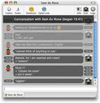
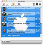
DescriptionMac OS 10.3.9 or better is REQUIRED.Why? - Shadowrunner 2 relies on improvements to webkit made in 10.3.9. Several important features will not work on lower systems, making the style virtually unusable. So, now that's all out of the way, why should you use this style?
CommentsYou can reply to individual comments by clicking the "Reply" link next to each. # by bob_the_gorilla on 10/31/04 at 14:29:18Yeah, I'd wondered about it. I may make it an option in the next release, because larger icons would leave a lot of white space between bubbles and I've been trying to avoid that.
# by bob_the_gorilla on 11/01/04 at 12:40:59v0.9 released 1st November. Changes - timestamps are now in rounded bubbles, and the code has been substantially cleaned and reorganised to make it more efficient.
# by bob_the_gorilla on 11/03/04 at 15:31:04Scottish, could you email me with details? Links work perfectly ok for me.
# by Katha on 11/15/04 at 20:04:50I would love it if the emoticons were places in the middle of the lines (if you know what I mean) in the bubbles.
# by bob_the_gorilla on 11/15/04 at 22:33:08So would I :) Unfortunately, I think it's largely a matter of how Adium handles emoticons. In fact, it's the same with all IM clients. If anyone has any ideas...
# by Ders on 11/17/04 at 23:45:41I like this a lot. Matches with my new choice of themes. Nice work.
# by on 12/08/04 at 01:58:09I love the look. Just one problem. Long away messages overlap their timestamps making both unreadable.
# by bob_the_gorilla on 12/09/04 at 16:17:07Thanks - I don't know anyone who uses foolishly long away messages, so I'd never have spotted that :) Will be fixed in the next release.
# by ISH on 01/02/05 at 06:26:32looks great... but how can you center the images you place in the background?
# by on 01/09/05 at 14:11:45This is exactely what I was waiting for, Thank u dude, the only think I would be greatful is, that all my icons are optimized for being on left, and mine on right side of the message list, so if that would be possible, could u pleas add one extra alternate style where that would be this way? Thanx dude, good work anyway.
# by atom on 01/13/05 at 19:12:28i love this theme. any chance you can make the history (old session) messages look different and be separated from the current session?
# by bob_the_gorilla on 01/14/05 at 22:22:30"Different" is a work in progress. It should make it into the next release. I'm not sure if I can separate them, or if I'd want to to be honest!
# by jesusfish on 01/18/05 at 04:33:09please oh please add a header to this theme. That would make it AMAZING
# by mathuaerknedam on 02/08/05 at 19:17:16I'm sure how much work it would take for you to implement in this style, you you can take a look at T?l to see how I separated the history there. Feel free to email me if my (uncommented) css/html doesn't make sense. Of course, even knowing how to do it, you may not want to? :)
# by bob_the_gorilla on 02/08/05 at 20:12:51My problem with changing the message history is that the CCS opacity property seems to leak rather badly, applying itself throughout the html document - so it's really sheer laziness, as instead I'll need a new set of images and to rewrite the classes... If anyone feels like doing it for me... ;)
# by mathuaerknedam on 02/09/05 at 01:26:53Ahhh... When I read atom's comment as requesting a visual separation between the context and current content (like whitespace, a line, a bar, etc). Now I see he could have been asking to have the context look different, and, of course, you don't need to look at T?l to see how to do that. (I offered T?l because I believe it is the only style to incorporate an actual separation between context and current content.)
# by bob_the_gorilla on 02/09/05 at 02:20:14Hmm, now I read it again I'd tend to agree with you, actually. Sounds like a lot less work for me anyway - cheers! Not that I'm lazy or anything. Ahem.
# by on 04/25/05 at 23:09:33Great message view, but the last letter(s) of the time stamps and the first letter(s) of the date stamps are clashing.
# by bob_the_gorilla on 04/26/05 at 09:03:57Dave, I'm not sure what you're getting at - unless you mean that the time stamps for the status messages can get a bit close to the actual message sometimes (only when you're displaying the time with seconds). I'll disable display of seconds in the status messages in a future release, to better fit with the rest of the style.
# by on 04/29/05 at 00:54:07I love this style to death (I used the older version), but this newer version has the "conversation started with blank at blank" on top of the chat windows. Very ugly and annoying... how do I make it go away? I'd hate to have to find a new style, :/
# by bob_the_gorilla on 04/29/05 at 02:02:07Christy: I hate it too, but I had several requests. There are two ways to make it go away. (1) Wait for Adium 0.8, due out soon, which has a checkbox in message preferences to turn headers on and off, (2) Find this messagestyle/download another copy, then control-click on it and choose "Show Package Contents". A window appears, showing the files inside the message style. Navigate in this window to /Contents/Resources/ and find the file called "Header.html". Delete it! Then close the window, and double-click as usual to install the style. This should work fine, but I haven't actually tried it. :)
# by Matisfaction on 01/29/06 at 07:13:20Set your Aqua Blue desktop pic as the background, looks top :D
# by andrewconti on 07/09/06 at 22:49:09Hey, I was just wondering if it was alright if I posted a style I made by modifying yours. Let me know.
Post a New CommentYou must be logged in to post comments. |


# by mrscott on 10/30/04 at 23:50:16