


|
Fluffy |
| Submitted By Pritthish Chakraborty (pritthish) |
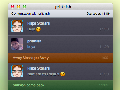
DescriptionBased on Twitterrific for Mac's UI, Fluffy not only reproduces the Twitterrific UI but expands on it, including various effects, animations and features.Based on adiumyCore, this is the most robust theme I have created to date. Hope you guys like it! Includes both dark and light versions Release Notes : V1.2 This is a major overhaul of the existing code. As such, you may have to toggle between Fluffy and another message style and or restart adium to see changes properly. ChangesV1.2- integrated non-avatar variants better. now possible to toggle using adium's "Show user icons" option - "Focus" indicators. This indicates the first unread message you received while the chat was in the background - Group chat topic headers (IRC and such, not something supported by MSN) - modified avatar container - Almost complete rewrite of existing backend - tons of bug fixes V1.1 - added non-avatar versions - tweaked animations - different textures for different status bars - modified header - bugfixes CommentsYou can reply to individual comments by clicking the "Reply" link next to each. # by gettingbored on 03/18/11 at 00:35:41Is it possible for you to alternate the colors of the two people in the chat?
Maybe also alternate from left to right like in iChat. Another suggestion, maybe for the "Away" and "Came Back" parts you can make it look like the "plank" if you will is missing and it says it underneath. If that makes any sense at all. I still love it not matter what :D And a contact list style would be boss. # by pritthish on 03/18/11 at 00:53:47what the hell is plank ? :S
# by gettingbored on 03/18/11 at 00:55:51Just how I was picturing each message area. If you imagine a row of planks on a boardwalk or something like that... http://www.photoshopstar.com/wp-conte...texture.jpg
They just remind me of planks... hahahaha # by pritthish on 03/18/11 at 01:00:16So a wood texture? Doubt that'll happen mate. It's overused and this is supposed to mimic the UI of twitterrific. If you want, you can make the change yourself, it's not too hard.
# by gettingbored on 03/18/11 at 01:11:04Oh sorry that's not what I was saying I was just using that to describe the area that I was talking about.
I love the way it looks now but I wish the colors alternated back and forth so I could tell super quick at a glance who is saying what. Flipping them back and forth can help with that too. I did this in Photoshop in a few minutes so the text is backwards and what not but you get the idea. http://dl.dropbox.com/u/8410101/fluff...rnating.jpg # by pritthish on 03/18/11 at 01:14:53again, like i said before somewhere else, i pretty much make themes that i will personally use. right now, i'm kinda sick of alternating sides. so yeah, maybe in some future version. again, feel free to look through the code (its well commented) and change it if you want :)
to do what you want, you want to give .outgoing .buddy a right:10px; instead of left:10px; and change the margins for .outgoing .messageWrapper accordingly :) # by gettingbored on 03/18/11 at 01:16:01I think I'll just do that. Thanks for the awesome Theme again!
# by pritthish on 03/18/11 at 01:32:24np. if you face any probs, lemme know :)
# by gettingbored on 03/18/11 at 23:17:22Did you have a Mockup at all for the theme? Like a way for me to preview it while I'm trying to change it?
# by mathuaerknedam on 03/21/11 at 20:57:21Nice. Two things I've noticed:
1) The timestamps almost, but not quite line up between header, chat messages, and status messages. 2) Could we get a dark header for the dark variant? # by pritthish on 03/21/11 at 21:01:441) the timestamp on the header isnt supposed to line up.
the difference in the status bars/message boxes has been fixed for the next release 2) not too sure :S i mean, im just following twitterrific's UI here, but i might add one as an option :) # by mathuaerknedam on 03/21/11 at 21:41:301) Okay, but it's close enough to being aligned that it's current state looks like a bug/oversight.
2) Okay. In either case, it's ultimately up to what *you* want. I'm only mentioning things that looked like they may not have been a conscious decision. :) Also, it it intentional that messages start at the top of an empty window? # by emaba on 04/06/11 at 22:53:58I found that sometimes is not possible to highlight the text. Could you please repair this? Sometimes is important to copy somthing written.
# by berliozz on 12/11/12 at 09:51:19Can you check this issue.
http://forums.cocoaforge.com/viewtopi...259#p135259 Post a New CommentYou must be logged in to post comments. |
;)

# by chetan51 on 03/17/11 at 00:16:28