|
SimpleSky |
| Submitted By Fernando Garcia (fernando2112) |
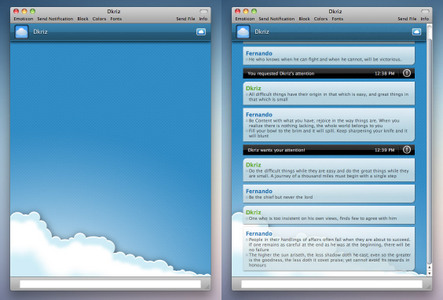
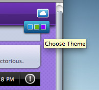
DescriptionIt's a sky themed with a cloud image on the bottom and without buddy icons.It comes with 3 color variants: blue, green and purple. It has an option inside the chat window to hide the header and to switch between variants, so you don't have to go to preferences>messages to change and reopen the chat window. To hide the header, just click on it, and to show it back, just click on the spot where it previously was, and it will fade back in. To switch between variants, click on the cloud icon on the right side of the header. FAQ - the mod for the window is from iDium- the moded scrollbar is from ThemeParkSky and cloud background inspired on liKalo wallpapers.ChangesVersion 1.1Fixed some color variations for each theme that I forgot to change in the first release >.< And made the distance between the window and the message boxes a little smaller. Version 1.0 CommentsYou can reply to individual comments by clicking the "Reply" link next to each. # by fernando2112 on 02/12/11 at 04:17:15Hey, thanks :)
Already did what you have requested, seems a little better now! And changed color variations for each user name on different themes, that I forgot to do on the first release. # by Akurin on 02/12/11 at 04:55:32OH ok I see what you changed. Haha, actually what I was originally requesting was if you could make the gaps between the sides of the chat window and the message boxes smaller. The change you did make however makes it look even sexier. :D
# by xescalation on 02/14/11 at 12:07:46I love it, maybe more colors? Also, maybe icons as well, large and small if possible?
# by fernando2112 on 02/14/11 at 17:53:37Thank you :)
More colors are coming in the next release, and I am gonna think about the icons as well. Take care! # by Letao on 02/16/11 at 06:23:21I love the theme! Do you think you could have a toggle for the bullet points, though? The emoticons I use make them not look right.
# by fernando2112 on 02/16/11 at 07:27:00Thank you !!
Can you show a screenshot of the bullets issue please? So I can prevent it for happening in other situations, in case my code has something wrong. Cya # by Letao on 02/16/11 at 09:40:32http://dl.dropbox.com/u/2343078/adium...mplesky.jpg
Your code is spot-on; it's the font your bullet points are in. And personally, I feel that they make it feel less like a conversation with their presence. Post a New CommentYou must be logged in to post comments. |


# by Akurin on 02/12/11 at 03:53:41
# by fernando2112 on 02/12/11 at 04:18:37
Thanks !