|
ArsTechnica |
| Submitted By mud212 |
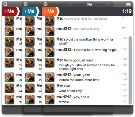
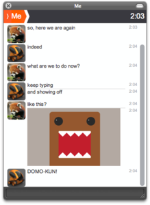
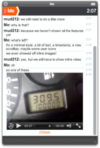
DescriptionA straightforward message style inspired by the latest Ars Technica layout. Features inline images (click to load, again to revert to a link, and shift-click to load in your default browser), as well as inline video playback.I've been using the Marten-plain emoticons. There is also a matching contact list style, and gnome's Adium HUD skin is available here. Changes1.6
CommentsYou can reply to individual comments by clicking the "Reply" link next to each. # by JackNapier on 02/25/10 at 11:12:01Can you make it so the conversation starts on top? for some reason when someone talks to me I can't see it because it's on the bottom and the scroll bar starts on top :S so I have to scroll down to see the message, this is the only reason as to why I'm not using this.
And you should make a contact list style to go with it :) # by eduyuliardi on 02/25/10 at 20:25:13hey, just wondering, how can u load an image or a video on the message list? can u teach me how? i just desperately need that :(
thanks # by cuddlebot on 03/08/10 at 14:21:23Hi mud212. I was just wondering - would there be a way for you to modify some things - like make another version of it where the icons are bigger and there aren't any names on the chat screen since there already is one on the header. Do let me know! OH! & another thing - is it possible to add animations to it like the ones that Renkoo has? Thanks.
# by Dan1jel on 03/12/10 at 07:15:36Awesome, but i update my safari to 4.0.5 and now the orange is little strange in my massage window.. might check it out :)
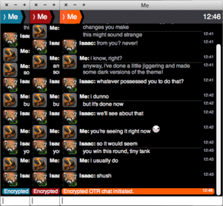
# by Douglerful on 03/20/11 at 07:47:47How did you manage to get the entire window black? Without the Apple streetlights? Basically How did you manage to make it look like it does above.
# by mud212 on 03/20/11 at 08:55:32I use the Adium HUD skin. Download and instructions at http://is.gd/YKBKwe
Post a New CommentYou must be logged in to post comments. |


# by Spookster on 02/15/10 at 19:21:25
will give this a spin for sure