|
Pretty Simple |
| Submitted By Piotrek Marciniak (piotrekm) |
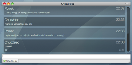
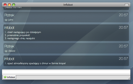
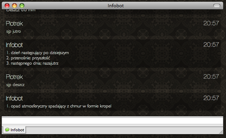
DescriptionA minimalist message style to match the Pretty Simple contact list style.Includes a set of backgrounds in case the transparent look causes troubles while scrolling or switching tabs. ChangesPlease noteIf you would just like to change the font size, without modifying the look of the font, in the Fonts window select the "Light" typeface instead of the "Regular" one. (This property unfortunately cannot be set automatically)
Any further changes to the style can be previewed on github before they are considered stable (yes, it was moved from launchpad): http://github.com/ptrm/prettysimple-adiummsgstyle Feel free to post bugs there. And to contribute, of course, too. CommentsYou can reply to individual comments by clicking the "Reply" link next to each. # by diskopo on 09/05/09 at 20:10:23I'm getting a weird indentation issue with the timestamps. Is there an option to fix this? Or is it a bug in the theme itself?
Here's the image: And if that doesn't work, here's a link to the image: http://tinyurl.com/naj9rf # by piotrekm on 09/05/09 at 22:39:13Actually it looks like a bug, but the point is the font in consecutive message's timestamp should be smaller than on the screenshot, yours is unexpectedly larger. So it looks like your version of WebKit interpreted the style in a different way than it was planned;)
Could you tell me what version of Safari do you have, and is this happening for all messages or maybe only outgoing? # by diskopo on 09/06/09 at 00:06:49Version 4.0.3 (6531.9), and I'm running Snow Leopard. It's happening for incoming and outgoing messages alike.
# by Cotecaceres on 10/14/09 at 17:24:12Hi, it's really beautifull, but Im having problems changing the letter size. It's too small.
# by Cotecaceres on 10/14/09 at 18:12:33yes is the same, I thought it was a sample. Ok , so I will wait until you add the ability to change the font size.
Thank you!!! # by batmandarkknight on 10/21/09 at 04:07:54i was wondering if you can have an update with an option to make the bars in the message box transparent. :D
# by drywa on 10/26/09 at 18:40:03i love it , its really beautiful
but there is a problem of the no scrollbar mode, adium will crash while i press the page up or page down key # by piotrekm on 10/26/09 at 21:28:10I have the same problem, it's strange and looks like a bug somewhere on the software part. I posted a bug report ( http://trac.adium.im/ticket/13251), let's wait and see what happens.
# by Mewzle on 10/30/09 at 12:18:25Brilliant design... wondering how on earth you got rid of the shadows though? I seem to get a shadow around every single message, and they start to fly all over the place!
# by Mewzle on 12/31/09 at 15:21:09[URL=http://img684.imageshack.us/i/screens...[/IMG][/URL]
Is an example of just one of the strange things that happens, it seems to be OS X trying to create drop shadows on the transparant parts. Also gives my mac a 'blue screen of death', where everything closes, if it is scaled beyond... about 300-400 pixels wide (Height doesn't seem to do anything) # by Mewzle on 12/31/09 at 17:40:02Aah, shadows aren't too bad, but that bar at the top seems to like moving around on my computer. I'm on 10.6.2, and the latest beta of adium. Can't think of anything else I've installed that might interfere with it... (The 'ghosting' happened on the stable adium too, so it doesn't seem to be that either..)
# by xemino on 02/01/10 at 19:02:37thank you, it's very sleek.
how about you group messages together, right now the name appears above every message, even if the partner hasnt replied. [IMG]http://imgur.com/knc0J.png[/IMG] # by xemino on 02/01/10 at 19:08:35apparently it does that, i just waited too long for the next message...
# by crux on 03/17/10 at 17:14:09great theme! would love to use it as standart... but I'm unable to change the font size (only while writing: "command +") how come!?!?!?
# by efisaac on 05/28/10 at 00:24:12hey i LOVE style!
but i can't change the font size, that's killing me i can almost read :S HELP # by paku on 06/18/10 at 16:26:12I created an account with Adium Xtras just to tell you how slick this style is. Great job!
# by frankga90 on 06/29/10 at 19:00:44when i change from one message tab to another the background of the first tab is like "burned-IN" in the background of the second tab :(
I love your skin but with that bug i cant use it # by yoaj on 08/29/10 at 23:25:02would be nice to change the message style background transparency. too transparent for me. wonderful look and idea though!! will still keep it as is but am certainly looking forward for an update!
thanks. # by piotrekm on 08/30/10 at 00:11:44You mean the background around messages? I don't plan to change that, you might want to try Elegant Simple fork of this style though: http://adiumxtras.com/index.php?a=xtr...tra_id=7394
# by kelleychambers on 07/17/12 at 20:44:56I don't care what new styles come out this is ALWAYS my defacto, go to style... it's my favorite and probably always will be. Clean, crisp and VERY minimalistic. KUDOS!!!
# by Jon47 on 08/14/12 at 22:35:23I love this theme! The only issue I have is that the custom scrollbar which was elegant and simple in Snow Leopard actually looks oversized and out of place in Lion+
Any chance of getting a version with no override to the standard OS scrollbar? # by piotrekm on 08/16/12 at 22:20:18A similar issue was opened today on github, in case it wasn't you or anyone else is interested here is the discussion: https://github.com/ptrm/prettysimple-a...le/issues/2
Post a New CommentYou must be logged in to post comments. |
|
||||||||


# by NeQuissimus on 08/18/09 at 22:11:19