|
Chat Sticker |
| Submitted By pedroL |
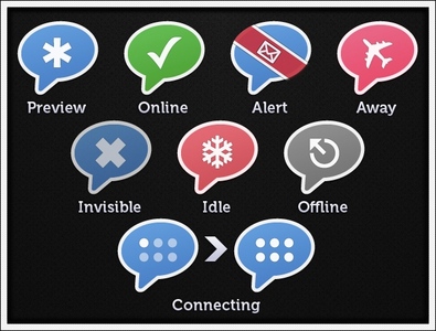
DescriptionAdium Chat StickerChat Sticker .adiumIcon based on David Lanham's "chat sticker" from "Sticker Pack 1". Feel free to give any suggestions... Also on: MacThemes deviantART ChangesVersion 1.0: Initial Release (waiting for suggestions...)ImagesCommentsYou can reply to individual comments by clicking the "Reply" link next to each. # by avalanches on 05/12/09 at 23:40:01I really love your idea and the way you made it, but there's one thing I don't like.
Your main colortheme is blue and red, the grey one is ok, but the green one (online) just doesn't seem to fit with all the others. But besides that, thanks great! # by joelandrew on 06/12/09 at 06:02:19I think the green color works well. Perhaps the idle could be changed to orange or yellow. Even if kept red, I think the idle icon would make more sense with a clock pic.
# by zakness on 09/05/09 at 03:56:26I agree. I would go as far as to say that each state should have a different color so that I can tell the difference in my peripheral vision without having to decipher a graphic within the icon. The problem for me is that my dock is short so the icons are small. I wouldn't change the shape of the icon, so I think overall color is really the best differentiator. Perhaps "Preview" could be white and "Alert" purple?
I must say though that this set is really great and I'm using it now! I only critique because I care :) Post a New CommentYou must be logged in to post comments. |


# by dcentity2000 on 04/19/09 at 13:15:01
# by pedroL on 05/07/09 at 15:20:00