|
Boxes |
| Submitted By camflan |
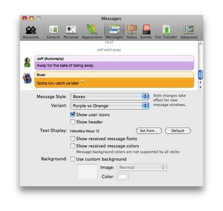
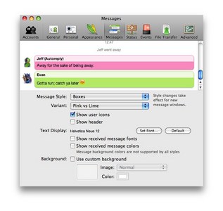
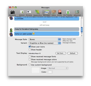
DescriptionI have always loved Adium, but I keep going back to iChat for the super clean "boxes" message style. I have now ported it to Adium. I have included all colors, and even the option to not have the sender's name show.ChangesJanuary 9th, 2008I have added timestamps. roll your cursor over the message to see when it was sent. April 12th, 2009 Now wraps long words/links instead of overflowing. CommentsYou can reply to individual comments by clicking the "Reply" link next to each. # by jotacosta on 11/20/08 at 10:30:21Love the message style. But there is one think I miss from ichat: random colors.
I tried to create an .php to randomize the color based on the sender's name, but that didn't work. Can I ask for your help to create a variant with random colors? Thanks # by camflan on 11/20/08 at 13:24:14I have planned on getting a random variant, I will work on it this weekend and see what I can do.
Thanks! # by jotacosta on 11/20/08 at 14:46:58Don't know your php skills. So this might be basic for you. Nevertheless, I was planning on using this "trick": http://www.dynamicdrive.com/forums/ar...-15449.html
Hope it helps :) Again, if you need help let me know. # by visualize27 on 11/22/08 at 09:13:43How does this messagestyle handle inline images on AIM? I prefer it if scrollbars appear on pictures over a certain size instead of the whole messagestyle getting wonky.
# by visualize27 on 11/22/08 at 09:14:48Oh I forgot. Look at how Stockholm handles inline images. It's that type I like.
# by camflan on 11/22/08 at 13:02:50Ok, I'll add that. Thanks for your feedback!
# by visualize27 on 11/22/08 at 14:30:48Hey, no problem. I already use this style but I haven't had the chance to receive a DirectIM with images yet. Lovely style. Thanks for making it.
# by superchris on 11/22/08 at 17:52:31Great message style! Only one thing is missing: the time when the message was send.
is it possibly to change it on my computer or to create a new version? # by th3answer on 03/06/09 at 23:21:36Great work mate.. but I've a little problem on it.. when I click and reclick on a emoticon, this emoticon becomes in a question mark icon and I can't visualize the emoticon.. any suggestion for resolve this problem?? tnx.. :D
# by Konstantino on 03/07/09 at 19:01:05I love this theme! I've actually been waiting for it for a long time. My only issue is concerning text wrapping. When a link is sent or text is too long, the words will just go passed the box and give me a horizontal scrollbar. Is there anyway to wrap the text?
# by b8drf on 03/31/09 at 05:47:07Hi - I love this theme, the only thing I missed was the timestamp which I see you have added in a recent update so I installed this today.
Is there any way you could re-position where the timestamp appears? I am not a fan of where it is currently (top left of the message itself) it would look far better and be less obtrusive if it were far right of the user name "banner" i.e not part of the message itself. Keep up the good work! # by camflan on 03/31/09 at 05:55:04Yours doesn't look like this when you hover over each box? http://img.skitch.com/20090331-npp585...cyps8rg.jpg
# by b8drf on 03/31/09 at 06:06:06No, I do not get that view via a hover, mine is permanently top left of the message text itself - am I missing something?
# by camflan on 04/01/09 at 02:31:23interesting. can you post a screenshot? or send it to me@camronflanders.com. thanks
# by b8drf on 04/01/09 at 07:01:38I re-installed the theme and re-started Adium and now it works as you describe ... interesting implementation ... any reason you didn't just place the datestamp permanently in the user header (vs the user having to hover to see it?) ... that would have been my preference ... not sure about others
# by camflan on 04/01/09 at 14:52:30a. iChat's design which this is a clone of, doesn't show it at all on a per-message basis.
b. it looks cleaner without the timestamp. c. every few minutes, a timestamp is inserted between chats as a "status message" in light grey d. to me, timestamps aren't important - if I really need to see it, I am willing to hover the cursor over a message or open my chat log. Post a New CommentYou must be logged in to post comments. |


# by incoldblood on 11/15/08 at 16:16:29