|
Paraphernalia |
| Submitted By stilist |
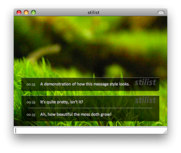
DescriptionOverview:This message style is the realisation of design ideas Ive had in my head over the past few months. It builds on the basic stripped-down code of a previous, unreleased theme. I release this message style as CC-BY/NC/SA. If you redistribute or modify, please include a credit to stilist. Please comment if you have a suggestion or a problemIll see what I can do. Image credits:
Note: This theme looks best if Calibri is installed, but will fall back to Tahoma. Changesv 1.1
ImagesCommentsYou can reply to individual comments by clicking the "Reply" link next to each. # by tasmanian_devil on 04/12/08 at 14:30:51i really like it!! [: i think (these are some suggestions)
-Different Variants, which would be really cool -More Backgrounds with the variants, i love this one -maybe fixing the fact that the name scrolls off my page- when the name is long other than that, u did a really good job! # by unisphere on 04/16/08 at 17:53:09is it just me, or will this not work with other fonts?
also, can you add an option to display screen names? thanks # by unisphere on 04/16/08 at 18:37:57one other thing - it could use mouse-over screen names, since in a group chat i dont know who said what...
# by smajor on 04/18/08 at 19:31:45Great theme, my new favorite. Since 1.1 letters such as jygp have their lower case dangly parts cut off. It's less noticeable with Calibri installed, but a couple rows of pixels are still missing even with the suggested font.
# by lelandrb on 06/09/08 at 00:45:53Amazing! The backgrounds compliment the style, brings back good memories of GAIA.
However, you need to work on the way usernames are displayed. The style leaves something to be desired. Personally, I think that the usernames should be smaller, and outside of the chat window. They just look out of place at the moment. Post a New CommentYou must be logged in to post comments. |


# by mathuaerknedam on 04/10/08 at 02:20:40
# by stilist on 04/16/08 at 16:55:10
First, the longest timestamp form is approximately twice as long as the shortest when using Tahoma (with Calibri its worse). The options I came up with were
1) always have the timestamp box at full width (which looks ridiculous with the small form), or
2) Completely change the display of the timestamp.
I may go with 2) next update, but for now Ive widened the box slightly.
Second, what changes would you suggest for the compact version? I browsed through the default themes, but didnt see anything that looked appropriate. This may change depending on how I handle the timestamp situation, of course.
# by mathuaerknedam on 04/16/08 at 17:20:03
I'll have to get back to you with suggestions for a compact version.