
|
yMous |
| Submitted By mathuaerknedam |
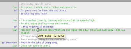
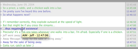
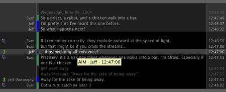
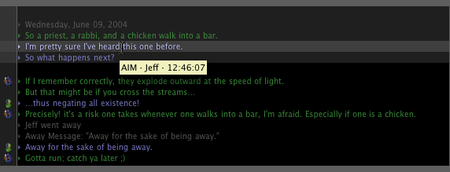
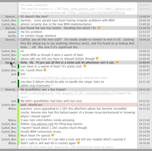
DescriptionCompact, simple, and clean. Only display the data you want. Anytime a column isn't visible, the message column expands to use the space. Also, columns are only as wide as necessary for the actual content. Everything scales to whatever size makes you happy. If you go to Adium's "Messages" prefpane and deselect "show user icons" the icon column will disappear. Direct-connect images default to thumbnail, but on click will resize to max width of column (or full width, whichever is smaller). The XtraColor variants display a small per-user color block between the sender and the message. Hovering the cursor over any message will highlight that message. Clicking on any message will also highlight all other messages from that sender. Props to David Smith for the javascript. There's no header in normal buddychat, but if the "show header" checkbox is selected then groupchats will show the topic in a header (in Adium 1.4). ----- Known Issues: Undersized graphical emoticons. If you know of a way to get emoticons to "float" vertically on the appropriate line without altering the line's height, I'd love to hear about it. Please report any other bugs/limitations you find. Changes(06/30/08) 1.2Misc minor tweaks. Displays red message background when mentioned in groupchat Made emoticons in message history a little less faint. Switched all colors to from rgba to hsla. Tweaked display of /me actions so that if the sender column is not displayed, the sender will be included in the message text. Replaced "+" variants with XtraColor variants, which assigns a (probably) unique color to each person. Also, consecutive messages from the same person still display the sendername. (07/21/08) 1.2.1 Misc minor tweaks. Fixed issue with dropshadow constantly appearing on message mark triangle incorrectly. Removed spiffy fade from background hover states. A webkit bug caused Adium to hold on to cpu (sometimes at 100%) until you closed the chat window! (08/06/08) 1.2.2 Misc minor tweaks. Disabled buddy icons in groupchat since you'd only see your own. Changed mention highlights to color message column only. Updated to messageview 4. (10/31/08) 1.2.3 Fixed problem with long lines not wrapping (02/09/09) 1.3 Added dark variants and renamed all variants as either Mercurial (light) or Saturnine (dark). Added a couple of pixels of margin at the top of graphical emoticons. Made the hover highlight background slightly darker in mercurial variants. Made hovered status text slightly darker in mercurial variants. Tweaked margins around icon, sender, and time. Tweaked mention and buzz/nudge highlights. Added window background color so that the white window doesn't show when the chat text doesn't fill the whole thing. Fixed a bug that caused status messages at the bottom of the window to not have the few pixels of breathing room that incoming/outgoing messages received. (04/07/09) 1.3.1 Added support for groupchat topics. Improved scaling for direct-connect images. (04/15/09) 1.3.2 Re-enabled buddy icons in groupchat, disabled them in IRC. (04/15/09) 1.3.3 Really re-enabled buddy icons in groupchat. Enabled tooltip sender prefix indicators for privileged groupchat users. (05/21/09) 1.3.4 Temporarily disabled CPU hogging animation. Enabled date in timestamp tooltip. Prettified focus mark for Adium 1.4. Switched to more efficient all-by-sender code. Changed all-by-sender to only activate on click, but allow clicking anywhere. Fixed bug where historical mentions wouldn't be properly highlighted. (06/04/09) 1.3.5 Tweaked appearance of focus mark. Fixed bug where focus mark would (invisibly) obstruct hover highlighting. Replaced sender with up-arrow in consecutive messages for all variants. Made empty topic editable anywhere via double-click. Stopped disabling all-by-sender in buddychat. Made all-by-sender highlighting match highlighting under cursor. Shrunk icons slightly to avoid weird bug where Safari 4 would cause them to shift. Removed grey border at top and bottom. Stopped highlighting empty space at top and bottom of chat, and at threshold of message history and current content. In Xtracolor variants, removed extra color from status and event messages. In Xtracolor variants, added 1 pixel space between color bar for each user. Added tooltip for sender with privileges (+, @, etc) and screenname (which may be different from the display name). Changed icon hiding to apply only to IRC rather than all groupchats. Reformatted actions (/me) to be more like standard IRC behavior. Increased contrast of highlighted status and event messages. Removed ability to temporarily enlarge icons by clicking on them. (08/07/09) 1.3.6 Fixed problem with text jumping up a pixel when using some font families/sizes and icons disabled. (Thanks to for reporting it!) CommentsYou can reply to individual comments by clicking the "Reply" link next to each. # by KHannibal on 04/08/08 at 18:00:13I really love your theme ! But I want to make the emoticons bigger, they're too small...
How should I proceed ? :) # by mathuaerknedam on 04/08/08 at 19:51:52Well, what I do is set emoticons to none. :) That way they're plenty big to see and I they don't throw off the linespacing. Alternatively, you could alter the messagestyle to remove the scaling.
# by KHannibal on 04/09/08 at 05:41:20Ok, so I edit the file named "_Base" and I erase the lines 65 to 92, correct ? :)
# by mathuaerknedam on 04/09/08 at 10:25:52Actually, deleting (or commenting) lines 71-74 is enough to remove all scaling. 67-69 prevents emoticons from being word-wrapped if you click on them, and line 70 will cause the extra linespacing (caused by big emoticons) to fall below the line. There's no harm in deleting lines 79-80, they're not doing anything. Line 81 makes the emoticons slightly transparent.
I want to note (for anyone else) that this will only be accurate for version 1.0. In looking it I I realized there was some cruft and clutter that will get cleaned up in a future release. # by thousand on 04/13/08 at 15:31:57i think you succeeded better on making the style i wanted to make! kudos!
# by pleanbean on 07/01/08 at 01:52:36Wow, this is great! another awesome minimalistic xtra, zesty! I have one question though, is it possible to change the xtracolor for the incoming and outgoing messages? Thanks!
# by mathuaerknedam on 07/01/08 at 02:06:04Thanks!
There isn't a user-accessible way to specify colors. I can force Adium to choose from my own color palette, but that same palette would apply to all chats and I couldn't control which color gets chosen. Adium automatically determines the xtracolor based on the sender's name. So, different outgoing messages from different accounts will have different colors, and different incoming accounts will have different colors. The per-sender colors should remain consistent between sessions. At the moment, the color palette is pretty limited (~20 colors), so you may see colors repeat. When 1.3 is released the palette should contain over 100 colors, so there will be a much lower likelihood of seeing duplicate colors. # by mathuaerknedam on 07/01/08 at 02:05:03No, Adium automatically determines the xtracolor based on the sender's name. So different outgoing messages from different accounts will have different colors, and different incoming accounts will have different colors. The per-sender colors should remain consistent between sessions. At the moment, the color palette is pretty limited (~20 colors), so you may see colors repeat. When 1.3 is released the palette should contain over 100 colors, so there will be a much lower likelihood of seeing duplicate colors.
There isn't a user-accessible way to specify colors. I can force Adium to choose from my own color palette, but that same palette would apply to all chats and I couldn't control which color gets chosen. # by pleanbean on 07/01/08 at 03:00:31Alright, but when i use this message style every incoming message is blue and every outgoing message is green. There isnt a way to mod the message style to alter that?
# by mathuaerknedam on 07/01/08 at 03:06:27Ah, I thought you were asking about one of the xtracolor variants.
Yes, the messagestyle can be opened up and modded to change those colors if you're comfortable with making changes to CSS. There isn't an interface to change the colors from within Adium. # by pleanbean on 07/01/08 at 03:09:01Yes, in referring to the outgoing/incoming text as well as the little colored bar that shows whos text it is in the xtracolor version. Would you be so kind to point me to which lines i need to alter to change the color? Thanks so much man, :D
# by mathuaerknedam on 07/01/08 at 04:06:09The xtracolor bar gets set in line 4 of content.html; Adium replaces %senderColor% with the color it chooses. However, the html makes no distinction between incoming and outgoing, so if you want to set specific colors for incoming and outgoing, you'll need to add new selectors and properties to _XtraColor.css.
To edit the colors for the fixed color variants, you'll need to edit _FixedColor.css wherever you see "Color:" For outgoing, lines 31, 36, 44; for incoming, 53, 59, and 66. # by pleanbean on 07/02/08 at 05:20:44Hmm fuck. I can't seem to successffully change the little arrows for incoming and outcoming messages. I defined colors for both incoming and outgoing in _XtraColor.css, but i dont think it did anything..Any suggestions?
# by pleanbean on 07/04/08 at 05:16:38Any suggestions? xO
# by mathuaerknedam on 07/07/08 at 14:25:51Sorry, I've been out for a bit of a holiday. :)
Between the defaults that are set in content.html and the overrides that are used in _FixedColor.css, you should be able to figure out how to set the colors in _XtraColor.css to display what you want. If you need more help, I'd suggest asking on the forums. I'm not opposed to mods, but taking the time to spell out the precise changes needed would likely take more time than making the mod myself. And since I have limited time for Adium projects, I'd rather spend that time making improvements to my own (released) messagestyles. # by Fenoxielo on 11/02/08 at 23:14:13I really like this style. The only little bug is that long messages (i.e. when someone sends a web address) end up extending the message column beyond the size of the window. This is pretty much only with URLs, since normal text never is that long and so wraps properly.
# by mathuaerknedam on 11/02/08 at 23:24:40This problem should be fixed in the version that was released two days ago. Areyou still seeing this in the new version?
# by Fenoxielo on 11/03/08 at 00:31:58Yes, I just downloaded the new version today and I am still seeing this.
# by mathuaerknedam on 11/03/08 at 01:08:36I can't duplicate the problem. Which variant are you using and what string of text won't break for you?
# by twisted on 01/14/09 at 18:55:09I really like this theme, however is it possible that you could make a dark variation? it's kinda... light ;)
# by mathuaerknedam on 01/14/09 at 21:13:08Thanks, and yes, I'm planning to make one. To get a feel for what how the coloration will look, Compare the Elysian and Stygian variations of Tül (http://adiumxtras.com/index.php?a=xtr...xtra_id=473). In the meantime, you could try out zMous (http://adiumxtras.com/index.php?a=xtr...tra_id=5812). You might even prefer it's colors to the ones I'll use.
# by irskep on 05/19/09 at 03:06:27I really like the look of the default theme (Mercurial), but I find the colors much too light. There isn't enough contrast. I made my own tweaks to the CSS, but I don't want to have to modify the package every time there's an update. Could you provide a theme with black text on a white/grey background please? Or perhaps just a version with all the text darkened 20%? (That's what I did)
I see that zMous also exists, but its light scheme also has too little contrast. I understand if you don't want to clutter up your theme list, but it can't hurt to ask. # by mathuaerknedam on 05/22/09 at 00:21:46Thanks for the feedback, I'm glad you like it. I regularly run my styles (including this one) by someone who likes the text at a higher contrast than I. We always find a compromise where we're both happy, so I'm inclined to leave it where it is.
And you're right, I'm not eager to make more variants. I reluctantly went from 4 to 8 when I added the xtracolor variants, and then again when I added the dark variants. I'm trying really hard not to end up like one of my other styles that has 88 variants, so unless something comes along that is significantly different or I find especially compelling, I won't be adding any more variants. Check with the author of zMous, Jannis might be less stubborn and more willing to increase the contrast. # by fuzzy76 on 05/25/09 at 11:46:41I really agree with this. In 1920x1200 this style become very hard to read becuase of the low contrast...
# by Raimondi on 06/01/09 at 05:46:41Thanks! I love this style but that all-by-sender on hover was killing me. Great work!
# by mathuaerknedam on 06/01/09 at 19:48:14With the next version the all-by-sender functionality will activate only by clicking on a message.
# by mathuaerknedam on 06/04/09 at 22:01:42You should find the behavior in 1.3.5 (just released) to me more to your liking.
# by CPngN on 06/02/09 at 19:50:55My icons don't work at all. In beta5 it still shows as OFF when I return to prefs about half the time. When I turn it back on... nothing happens. I love the color coding (though I think there should be a way to make the nicks themsevles color instead of a box next to them), but I can't get icons to show with this style at all. :(
# by mathuaerknedam on 06/04/09 at 22:02:40Icons are currently disabled in all groupchat, though in the next version they will only be disabled in IRC. I hate seeing per-sender coloring on nicks (and I find them less effective than the boxes), so I don't anticipate adding that feature.
# by mathuaerknedam on 06/04/09 at 22:04:061.3.5 (just released) has icons enabled everywhere but IRC. However, the icons are still pretty tiny, so I'm not sure how useful you'll find them.
# by CPngN on 06/04/09 at 22:19:28I'm confused.... so they're not enabled for IRC, but yet they work.. (though tiny).
I figured i can hack in the nick coloring pretty damn easy with 1 css line edit, so I'm going to try that. I wish I could force my lines to stand out more, like always bright white or something. Also, I have yet to see the topic bar show up. I see the code for it, but I've never seen it render. But I'll check out 1.3.5 first before I complain about that. Is there a way to make the mark added by "add mark" show up in the text itself? (say, as a red underline) ala Colloquy..? # by mathuaerknedam on 06/04/09 at 22:34:44Icons don't work for irc, but everywhere that they do work, they're tiny. They are scaled according to the size of the font (1.1em), so if you make your font bigger the icons will be bigger.
The nick-coloring happens primarily in Content.html. Something like ".outgoing{color:white;}" should work. Do you have Safari 4 beta installed? I've seen the topic have issues when Safari 4 *isn't* installed, but I've not been able to isolate the issue. Adium doesn't provide a way for the user-mark to show up in the chat window, only in the scroll bar. Only the focus-mark gets put in the chat window. # by CPngN on 06/05/09 at 01:49:34I installed Safari 4 beta, which I guess I had skipped since I barely used it. But makes sense that it would change things since you use webkit and the update surely updates webkit renderer. So now I can see the "last" mark on the right, and the up arrows when someone types 2+ lines, and the topic at the top. Hooray!
So.. major tip for everyone using Adium 1.4: install Safari 4! # by mathuaerknedam on 06/05/09 at 02:24:02Well, the focus mark changed from previous releases, and the up arrow is brand new. There shouldn't be any functionality in the Adium 1.4 beta (at least as of 1.4b6) that requires Safari 4. If it does, that's likely a bug I've not squashed yet.
# by craig_ravellette on 06/17/09 at 03:08:00Noticed that the time in IRC doesn't contain AM / PM. Any way to enable that from the templates, or _Themes ?
# by mathuaerknedam on 06/17/09 at 03:58:21yMous should use whatever timestamp format is selected in the Advanced preferences, messages subpane. Have you selected a timestamp with AM/PM?
# by clutterskull on 08/04/09 at 22:04:39I love this style, but I am having a major problem in IRC that I can't seem to fix myself.
When hovering in XtraColor, the mark changes from the colored bar back to the arrow and highlights the line. If the line is the first message from that user (meaning there is a 1 pixel spacer between that user's color and the user above), the entire line moves up by 1px. If you mouse down on the message, all of the messages from that user are highlighted, meaning that the display moves up by however many messages that user has. This sometimes makes links impossible to click (as they are activated on mouse up, and by then the screen has moved). Any help would be appreciated. # by clutterskull on 08/04/09 at 22:06:49I also want to mention that if this theme weren't so incredibly awesome for group chat, I would have just picked a different theme rather than deal with the annoyance. None of the other themes even come close to this one for functionality and readability. Nice work, mathuaerknedam.
# by mathuaerknedam on 08/04/09 at 22:27:27Thanks for the compliment.
The problem you describe is really odd. I've not experienced this and it doesn't seem to have been a problem for anyone else, so I'm afraid I may not be able to resolve it. But that won't stop me from trying! :) What version on Adium, Safari, and OS X are you using? Do you only see this problem in XtraColor variants, or does it happen in all variants? Does the problem happen in the messages prefpane preview, or only in a real chat? Also, could you post somewhere a screenshot of your messages prefpane so that I can see and duplicate your message style preferences? # by mathuaerknedam on 08/04/09 at 22:28:48Two more questions:
Are you sure you have the most recent version of yMous? Have you restart Adium since installing yMous? # by clutterskull on 08/04/09 at 22:56:58I have installed and reinstalled yMous several times today, and have restarted Adium a few times as well.
OS X 10.5.7 Safari 4.0.2 (5530.19) Adium 1.4b8 The problem only occurs on XtraColor variants, but happens in both Mercurial and Saturnine. The problem does occur in the prefpane, but the fewer messages there are, the less pronounced the problem (it's cumulative), so it's hard to notice there. Prefpane: http://imgur.com/Kqifc.png Chat, no hover: http://imgur.com/XvZgC.png Chat, hovering: http://imgur.com/ABLAz.png (note the shift) Chat, hovering over a continuing message: http://imgur.com/6D8VB.png (no shift this time) Chat, shifted scroll after clicking on a message: http://imgur.com/SHStX.png I will be happy to give you any other details that I can. Thanks for your time. # by mathuaerknedam on 08/04/09 at 23:52:19Good news, I can reproduce it using the settings from your prefpane pic. It seems to happen with: any XtraColor variant, "Show user icons" deselected, and many (but not all) fonts. Of course, the fonts I'm prone to use all look fine. :) Curiously, sanserif fonts like (Lucida Grande, Helvetica, Tahoma) seem to be more like to work (though many other do not). Even more curious is that Century and Century Gothic are fine at 10, 11, 13, and 14 pt, but 9 and 12 pt have the problem!
Unfortunately (for fixing this), my wife just had a baby less than 9 hours ago, so my time to devote to isolating and fixing the problem may be rather limited in the immediate future. :) In the meantime, I'd suggest trying a different font family/size. I'll see what I can do. # by clutterskull on 08/05/09 at 00:00:12Congratulations!
Sounds like a reasonable work around; I'll try it out. Thanks for your time! # by clutterskull on 08/05/09 at 00:06:55Yep, that works like a champ. Must be a webkit rendering oddity.
# by mathuaerknedam on 08/07/09 at 22:30:11It was a bit of CSS selection sloppiness on my part, though I'm not sure why the problem wasn't more consistent. I just uploaded 1.3.6, which should fix this issue.
# by dunolie on 09/05/09 at 03:49:29Love this theme!! like the way you can collapse pictures in the messages. Thanks for improving my adium usage so much :)
# by chicagoisonfire on 03/01/10 at 01:11:35This is my favorite theme, but was just wondering, is there a way to make it so no two parties in a chat have the same colors? happens every once in a while and can make some things pretty confusing
# by mathuaerknedam on 03/01/10 at 02:01:58Unfortunately, no. Adium chooses colors based on the username so that it's consistent each time. It *might* be improved by randomly choosing a color for each user each chat and keeping track of each color in use so that no to colors are used concurrently. However, there no guarantee that with enough users you wouldn't end up with two colors that are different but indistinguishable, so it may not solve the problem. Also, I suspect the developers would find the value of consistent per-username colors to be of more value than decreasing the (already unlikely) likelihood that two users wouldn't have the same color.
# by EvilSpoonman on 03/01/10 at 06:33:28Hey, love this message theme, use it exclusively - I only have three questions about it.
1. I tend to gather up pretty extensive chats (days worth). The neat feature where it hilights all by sender when you click begins to take multiple seconds to display (during which the app is 'hung'). I do not need the feature, and would be happy to hop into the packaged files to erase the script if you could direct me to where it is. Or explain another workaround. 2. I do not like the up arrow displayed when you have multiple messages by one sender over a short duration. Equally curious if I can disable this by simply erasing a line in the CSS someplace. 3. Copying is a bit of a bugger, has lots of artifacts (especially with the XtraColor Sender mode I have it in). Is there a way to clean this up any? I current hop over to the log and copy clean formatting from there when I need to copy out of messages (or search messages grrr ). It would be nice to copy cleanly from the message window. Thanks # by mathuaerknedam on 03/10/10 at 06:57:15I'm glad you like it. Be aware that the modifications below may not work in a future version.
1. The next version of yMous has a big improvement in the performance here, but you can delete footer.html to get rid of it. 2. Open _Base.css and delete lines 142-148. The sender will still be hidden on consecutive messages. If you want consecutive messages to display the sender, also delete lines 137-141. 3. What sort of artifacts are you seeing? The only thing I see is a tab between each item. Unfortunately there is a bug in Apple's WebKit that inserts tab, newlines, etc, even when none of it exists in the HTML. The Adium Dev team recommends copy/paste from the log viewer, as you already do. It's annoying, but I don't know of a way to fix it. # by iynque on 06/08/10 at 06:44:41Any time an action ends in a colon, it gets turned into the kissing emoticon and the timestamp formatting (right column) gets messed up: http://cl.ly/8258c516d37348da75ec
It only messes with the offending message, so it's not so bad, and other message styles will display it correctly. I'm guessing it's just because *actions look like this* and so one *ending in a colon like this:* creates the kissing emoticon (:*) at the end. I don't know if it's possible to ignore emoticons there or to insert a trailing space at the end of actions before the trailing *.... Oh well, just thought I would let you know. Like a few others, I LOVE this style for group chats! # by mathuaerknedam on 06/15/10 at 21:40:49I'm surprised you don't see this in any other styles. I was able to duplicate this in Mockie, and even in a message style that italicizes actions rather than using enclosing asterisks. In any case, I have no control over emotification; this is an Adium bug that was first documented over a year ago (http://trac.adium.im/ticket/12009).
# by flyx on 02/05/11 at 19:27:58This style horribly screws Adium up. Adium stops responding for freaking 5 Minutes when I enter a multi-user chat with a long server backlog using this style. I switched now to xMous, which handles this without problems.
But apart from that, it's a really great style. Post a New CommentYou must be logged in to post comments. |





# by evands on 04/06/08 at 16:54:11
# by mathuaerknedam on 04/06/08 at 18:28:55
Also, did you see this behavior when using 1.2.4 or the svn version that fixes the prefpane's font size/color bug? An inconsistent font size is the only thing I can figure out that could cause the problem, especially since I have almost everything dimensioned in terms of em. Is there anything else from the checkbox that could possibly affect a messagestyle's layout?
# by mathuaerknedam on 04/07/08 at 15:35:50