|
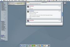
It's a Dock! |
| Submitted By tavilach |
DescriptionA style that gives your contact list the simple and clean look of the dock!Update (10/18/04): This contact list style has been ported to Adium X 0.7! You are downloading both a list layout and a color theme. ImagesCommentsYou can reply to individual comments by clicking the "Reply" link next to each. # by CzarDerivative on 08/17/04 at 16:34:26OMG DAMN TAVI, that theme is FREAKIN' AWESOME... holy crap your skills r0ck the h0us3!!!
# by on 08/17/04 at 20:00:16Tavi is my bff and ya'll should love him too and he's uber smart and berkely is the best school F stanford! plus his little invention rocks the boat.
# by on 08/18/04 at 05:01:11The Bears obviously have the best designing skills. This is one awesome theme that everyone should download. Perhaps Adium should even consider making it the default it's so good?
# by BlueRevolution on 08/28/04 at 19:58:34nice idea, just one tip - turn the shadow off to make it look more like the Dock
# by kres on 08/29/04 at 21:06:05kool theme
but how do you do to make the white bar of the contact list disapear ? # by tavilach on 09/23/04 at 23:07:07Kres,
To remove the titlebar in Adium, just go to Preferences -> Advanced -> Display Preferences, and check "Borderless." If that's not what you're referring to, then I don't know what you're talking about. Care to elaborate? # by Magflux on 10/19/04 at 04:00:18Nice theme! Goes along with the message view style... what is that message view style anyways??
# by tavilach on 10/19/04 at 04:22:56Thanks, Magflux! The message view style is good old "Smooth Operator," which comes with Adium. I just customized the background color to match my contact list style.
# by tavilach on 11/02/04 at 03:19:40If anyone has any suggestions to improve this theme, I'd more more than welcome to listen!
# by on 12/25/04 at 15:32:33Can U send me the name of the network monitor u're using on your titlebar?
# by tavilach on 02/01/05 at 00:44:09Admin, the network monitor is part of MenuMeters (http://www.ragingmenace.com/software/...menumeters/), by Alex Harper (who also wrote SideTrack).
# by on 02/01/05 at 23:12:01I luvvvvv it! I like the look of this so much...for I do not like screen clutter on my desktop. It pleases me muchly. Thanks Tavilach. =)
# by on 03/16/05 at 07:48:47hey tavi, really awesome work...i love it. what's the iTunes controller you're using in your menubar? also what's the icon to the right of it for?
# by tavilach on 03/16/05 at 08:39:23Thanks, reiyn and Tony :). The iTunes controller is Synergy (http://wincent.com/a/products/syne...rgy-classic) and the icon to the right of it is Salling Clicker (http://homepage.mac.com/jonassalling/...are/Clicker) :).
# by dan on 05/04/05 at 07:37:18is there anyway to get the title-bar to become invisible with v. 0.8? I cant find the option in the customize menu.
# by on 05/06/05 at 14:14:21Thanks a lot for this one! However, I can't seem to make it transparent in Adium 0.8. Do anyone know anything about this?
Post a New CommentYou must be logged in to post comments. |


# by Junpei on 08/17/04 at 07:46:19