|
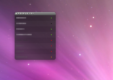
Dot-dot-dot |
| Submitted By Johnny Fox (blablah01) |
DescriptionThese are probably the smallest, most simplistic status icons you will ever see. Each of them is exactly 4x4 pixels large without a drop shadow or anything else that could possibly clutter up your contact list.I originally made them for myself but thought i'd share them anyways! Goes best with a very simplistic contact list style! Oh and: this is my first extra, so... I just made it in about 5 minutes and posted it here, thats it :) it works for me, so i guess it should work for everyone. Enjoy! ChangesInitial release.Images CommentsYou can reply to individual comments by clicking the "Reply" link next to each. # by av3ry on 08/09/09 at 22:08:51I love these!
However, I think people who are mobile should have a different icon color than those who are just 'away.' I've accidentally 'left' messages for people who it turned out were actually mobile. :l # by av3ry on 08/09/09 at 22:11:17Actually, I apologise. I got yours mixed up with another very similar icon status. I forgot I'd switched from 'Dot Dot Dot' to the other one as a test. (At 5am, so perhaps I should avoid them that early, lol.)
many apologies :( I do still love them, though! I've just switched back. Post a New CommentYou must be logged in to post comments. |


# by mathuaerknedam on 10/25/07 at 16:59:23
# by blablah01 on 10/25/07 at 17:08:13
# by mathuaerknedam on 10/25/07 at 17:11:57
# by blablah01 on 10/25/07 at 17:15:42