|
darkgray |
| Submitted By maszok |
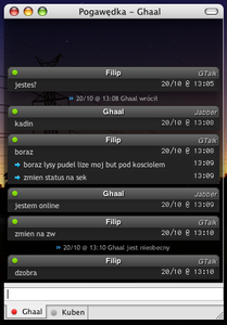
DescriptionI coulnd't find a nice message style for Black Is Beautiful, so I made my own.I hope you'll enjoy it. ImagesCommentsYou can reply to individual comments by clicking the "Reply" link next to each. # by zipper on 10/22/07 at 16:56:52This is amazing, one of the best message styles I have ever seen! Some other colors would be nice, especially a white, or light gray one. Still, amazing, and extremely usable. I like the touch of having statues icons inside the message, works well, and is something I have never seen before.
# by maszok on 10/22/07 at 18:46:20Thanks for the comments. Zipper - I will update the style with a lighter colour variant as soon as i get some time.
# by limegreenhero on 10/22/07 at 21:52:16Very nice! I'll definitely be using it. I love the status icons. Would it be possible to make a no scrollbar version?
# by maszok on 10/23/07 at 12:54:36limegreenhero, you could add "overflow:hidden;" to the body selector in main.css to get rid of the scrollbar but without it you won't see the whole chat so i don't know why hiding it.
# by oisterjosh on 04/15/08 at 22:14:50When the messages after the first one come up, they are in 24-Hour mode, even if my time format is set to 12-Hour.
# by aotsukidays on 06/02/08 at 20:02:02It seems very amazing but for some reasons my background is not transparent at all...
# by maszok on 06/03/08 at 11:31:48you need to set transparent background in adium's preferences (just change the opacity in message styles settings)
# by aotsukidays on 06/04/08 at 06:40:01Oh yeah thanks ! Now it's just the best message style ever.
# by azenis on 07/02/08 at 13:13:00I love it! Looks fantastic, only wondered if there was any way of getting your contatcs icon to display in the chat? Also if you can turn off the bit that says what they are logged in as (MSN, AIM etc) Would be AWESOME if there was a way to get the icons to display in the position where the MSN/AIM etc indicator is on the right hand side?
# by letmein on 07/17/08 at 07:57:09Hi there, love this message theme, but for some reason the background behind my buddies names isn't appearing in my window (the round corner darker grey box behind the word 'filip' in the above screenshot). Any ideas?
# by rmm5t on 02/09/09 at 14:03:29This theme is really nice. It would be perfect if it offered some slight color variation between "me" and "them."
# by theadamkramer on 08/20/09 at 21:45:31Hi maszok,
I made a variant for the people who wanted it without the scrollbar, if you want me to send it to you so you can update the style. Also, I have been trying to figure out how to make a variant where the user's addressbook picture could be used as a faded background image, stretched in the window. I asked The_Tick about this about a year ago and he said the ability to do it was coming soon, and spoke to Zac a little while ago and he said - "the user's icon is just a %replacementKeyword% so you can probably do it". I don't understand exactly what that means, so I figured I'd pose it to you since I'm using your awesome style :-) feel free to email me at adam at adamkramer.com or AIM me at TheAdamKramer ! Thank you! # by baronvonbadguy on 10/18/09 at 03:20:42for those who wanted to get rid of the service tag and correct the 12v24 hr clock time on the subsequent messages, here's said style.
http://b5.s3.p.quickshareit.com/files...ip385b2.zip just unzip and install to ~/Library/Application Support/Adium 2.0/Message Styles/ # by Project_X022 on 07/31/10 at 02:52:28Would it be possible to round out the bottom corners? Nothing too drastic, just to give a smoother look.
Post a New CommentYou must be logged in to post comments. |


# by dcentity2000 on 10/22/07 at 14:03:51