
|
Metal Gear Solid |
| Submitted By Mark Fickett (Perez) |
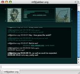
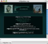
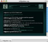
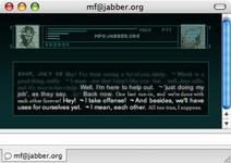
DescriptionMessage style inspired by the codec from the game Metal Gear Solid.Broken-ness disclaimer: This style may be broken with Leopard (meaning, the latest Webkit). I have no plans to fix it. If you fix it and want to let me know so I can point to your version, I'd be happy to. Download also available at: http://www.markfickett.com/stuff/artPage.php?id=393 The screenshots are of the variants in this order: Default; Codec - More Info; Codec - Pure (as much like the MGS codec as I could make it); Small Header; Small Header - Tül. Be sure to get the free font Silkscreen, which this view makes use of. Fixes/Updates 0.5 to 0.9: New default icons (Snake and Otacon) Animated static (CPU hit) Small Header variant Fixed chat-area sizing issue with few messages present Copy-paste friendly ...and a few new/different variants for text styling Possible improvements: Max out the large-icon variants: 96x96 Protocol with the time in the header (not available just now from Adium) Bigger space between content and context Optionalize static animation Changes2008 May 15: Updated to work with Leopard2007 Nov 24: Officially no longer supported. CommentsYou can reply to individual comments by clicking the "Reply" link next to each. # by on 07/25/04 at 15:20:28great theme, in the next update could we possibly see a difference in message history and normal text, and emoticons are too large for the spacing you have of messages... Could you introduce a new style where repeated messages from someone, rather than appearing on the same line, like other styles, appears indented on a new line?
# by retrogamer on 07/25/04 at 15:43:20Looks great! However, are there plans to make the "static" (scanlines.png) over the buddy icons animated? (Right now you use a translucent .PNG, but you could make an animated .GIF and set the opacity using CSS).
Also: for animated buddy icons, would it be hard to only animate the icon of the last person to talk? If you could address these two things, this would be perfect! # by retrogamer on 07/25/04 at 15:46:54For information on CSS transparency (among other cool effects): http://www.mediaworkers.de/text-align.../index.html ...I also forgot to comment on the horizontal lines by the person's alias: are you planning on smoothing them out or are they always going to be boxy?
# by Reikon on 07/25/04 at 15:57:03I might be able to make an animated .gif for the scanlines if you want...btw this Message View owns (my aim is reikonmusha if you wanna talk about scanlines etc.)
# by Crazycole2001 on 07/25/04 at 16:27:00 does any one recommend a font for this message view, because everything i've tried looks a little off
# by lax4782 on 07/25/04 at 18:02:54Would it be possible to make a new variant with a smaller sized header?...I like the view a lot, but I use a rather small message window and can only see one or two lines of text at a time.
# by on 07/25/04 at 18:04:06retrogamer: I would love to make the scanlines animated, however I'm almost positive that you can't control the alpha of images through CSS. (I looked at the link, and I don't see anything other than text/divs/etc.)
History at the moment should be italicized; other ideas for it are welcome, but I've found that color changes only affect outgoing text reliably (and text-shadows are equally finicky). New-line subsequent messages could be a possibility (for left-aligned, most likely). I'm realizing this has potential to get confusing... if you have comments that will want a response (and to look for my responses), go to the http://www.funmac.com/showthread....php?t=8234 (MGS thread) in the Adium forums. # by on 07/25/04 at 18:30:51...and... No, I can't control the animation of .gifs, that I know of. It would be cool. I probably will make a minimalized variant, which will include a smaller header. I wasn't planning to smooth out the bars; at the moment they're <div>s, so that would involve taking those out and putting in a PNG or GIF... which wouldn't scale sideways as nicely.
# by on 07/25/04 at 21:10:39history, rather than italicized, should maybe be in a transparent slightly greyed box so it differs.... hows that idea?
# by on 07/26/04 at 00:57:14A few thoughts:
The history colors seem to be opposite of the normal (in history, the other person's text is white and mine is greenish, and when i go back to normal mine is white and his is greenish.) The static could stand to be more subtle. # by on 07/27/04 at 00:46:39Great theme but WAY too much space is wasted on the buddy icons. Trim/slim it up and I'm a dedicated fan.
# by freeze on 07/27/04 at 02:59:27the ONLY thing you need to change is...have it actually go down a line when you hit return. none of the options do this.
otherwise, awesome # by mnkeybsness on 07/28/04 at 11:25:031 problem, 2 solutions: The centered text really messes with my head. I suggest to either make the text left or right aligned like other styles, or else make the message start on the line right after the sender's name/timestamp.
# by mathuaerknedam on 07/29/04 at 13:11:13I agree with mjkeybsnss. Where you use centered text, I'd center the timestamp and/or buddyname on the preceding line.
# by on 08/02/04 at 04:34:36any chance for consecutive messages to be carriaged one line down instead of continuing in the same line? it messes up the usual flow and continuity im used to.
otherwise this message view is my current fav # by on 08/10/04 at 05:47:42In regards to CSS and transparent images.. I found this URL on a google search:
http://www.domedia.org/oveklykken/css...y-image.php Hopefully that helps score the cool animation avatar stuff :) Also, it'd be cool, if in the area where you have the time, if it said what protocol it was using (e.g. AIM, Yahoo, MSN, etc..). Great job! The only skin I use :) ~F # by Onyx on 08/22/04 at 22:25:45I really really love this style, although the only thing that bugs me is i sometimes have trouble seeing who typed what. I can make it so it has sender and times, but i still want the clean look. Is it possible for you to get it to have coloured fonts or something similar, so that u can see the order? that would be great!!!
# by Omamori on 01/03/05 at 10:33:30Nice style. But can you insert a line break for consecutive messages?
# by on 01/26/05 at 22:15:54Don't listen to these complaints. Compared to the rest of the message view styles, your's ranks #1 in my books. Keep up the good work and thanks for making my screen look better.
# by on 06/22/05 at 21:50:55For some reason, I cant see buddy icons. Its just a blank box up there. Im running the latest adium and tiger.
# by on 07/05/05 at 20:50:06Any chance of getting a version that leaves less dead space around the content box? It's a beautiful theme, but it just leaves too much wasted space around the text. Although, I guess that might be too much of a diversion from Metal Gear Solid.
# by on 07/05/05 at 20:53:02I would love to see different color variants, if it wouldn't be too much work. Sweet looking theme :-) I love the static.
# by on 07/06/05 at 01:00:30HOLY CRAP!!! YOU GOT THE ANIMATED SCAN LINES! MAD-PROPS!!!!!!! THIS IS THE SICKEST MESSAGE THEME OUT THERE!!!
If you can't see the header, make sure you check "Show header" in the message prefs. # by on 07/07/05 at 17:06:43Icons don't show up for me. The header area is blank. Otherwise, this is money.
# by on 07/07/05 at 17:40:26I also don't see anything for the header. I'm using Adium .82 on 10.4.1
# by on 07/07/05 at 20:56:46I see them under .82 / 10.3.9 (using the posted version)... I'll have to check it out when I have Tiger in a few days. In the meantime - you're sure you have Show Header checked, and the lines around the message area show up (proving Header.html is being parsed at least)?
# by on 07/09/05 at 09:54:54No lines or borders at all, just the background and text. This is with the latest linked download to Adium and 10.4.1.
# by on 07/09/05 at 10:39:13Got it working by checking user header, forgot that option was in .8x. I'm sure I could probably hack it to take them out but could we get a variant without animated scan lines? It's quite a processor hit, and I'm sure I'm not the only one running a sub 1Ghz processor.
# by on 07/09/05 at 12:59:34I'm on a 400MHz G3 (soon to be upgraded), so I hear you about the animated scanlines. (I'm trying to think of the best way to do that - javascript that you click on? use the 'include header' switch...but then where does the rest of the header go?)
So - does anyone not see the header /with "Show Header" checked/ ? # by on 07/30/05 at 12:25:12Great stuff. I love it. This along with the MGS2 sound set....All we need now is a good contact list set up like this. Maybe something that looks like Snake's item/weapon inventory?
# by mrhaiiro on 10/10/05 at 03:35:25hmmm...sorry for the annoying noob question but how do you use this with aim?
# by norbi on 10/12/05 at 19:14:04This is totally the best message style out there. Even if you dont like MGS this is the coolest looking one (i do like MGS, which obviously makes it even better).
I don't see everyone's problem with the text colour, the white/grey is an obvious difference. I use 'Lucida Grande' - 14. It looks pretty close to the text in the MGS3 codec. I got an idea (although somewhat impossible to do [but it would rock more than anything, ever]) when the buddy signs out, their icon closes/dissapears. Oh, and as everyone has said, the soundset just adds to it so much. Thanks for the best message style... # by SolidusBoss on 05/01/06 at 06:30:04I can use font but can you tell me how to get background ON?
# by SolidusBoss on 05/01/06 at 06:35:38where do I have to extract:: metal_gear_solid_message_view_styles52481?
# by mongoos150 on 05/29/06 at 15:40:37I REALLY wish we could make the chat window borderless (like the contact list) - anyone know how? This skin is great, BTW.
# by fatpeopleeat on 07/07/06 at 01:33:39Hmm... I don't mean to be a nube or anything, but where do I put it?
# by werthog42 on 02/03/07 at 06:14:46Argh... Doesn't work right on Adium X 1.0. Anything I can do to make it work, or does it need to be updated?
# by OnlyTheSnake on 03/28/07 at 13:35:15it would be nice if there was the option to alternate between left and right align for my text and the other person's text. of course i don't know how this would affect a group chat, but just putting it out there.
# by OnlyTheSnake on 03/28/07 at 13:39:36also, it would be nice to have the option to resize the user icons.
# by xsuite on 03/31/07 at 19:14:07I cant change my text color. It always shows up as a dark grey unreadable color. How do I fix it? Thanks!!!
# by CyberSkull on 05/25/07 at 05:25:12The codec header doesn't work with Adium 1.0.3.
# by ArcturusX on 11/05/07 at 02:43:14I think I did something really stupid, but whenever I have more messages that can fit on the screen (i.e. I need to scroll to get previous posts), all of my messages disappear and I'm left with nothing but the header and a blank box. I'm using Adium X 1.1.3, with 10.4
# by doiboi on 11/24/07 at 00:57:11Hey dude, my thing started to mess up. I don't know if it's a bug or not, but yeah...
# by blackstar87 on 11/24/07 at 01:59:31So for some reason the scroll function does not work with any kind of header. Once a conversation exceeds the window I cannot see any of the conversation and cannot scroll up at all. If I turn off the header it works but otherwise it doesnt. Any suggestions? I've re-installed it like 4 times.
# by Perez on 11/24/07 at 04:56:32For those of you having trouble, I'm sorry to hear it, but am no longer working on / especially interested in this style (and haven't been in a few years). If someone makes a fix, I'll be glad to post it or point to it. (For those cases where it still works... glad you like it!)
# by Contradiction on 12/01/07 at 15:52:12Although, it won't work for me.
The messages do not appear even though I'm not on Leopard. # by JonnyBGod on 03/31/08 at 23:07:50hey,
I just corrected the problem. Here is what you have to do: Edit template.html file with some text editor or dreamweaver. On line 100 replace static for relative. reopen the mod in adium and you should be all right now. this works for me under leopard # by Perez on 05/15/08 at 21:46:37Made this fix in the style and uploaded it. (Thanks for posting the fix.)
For reference, you should be able to edit any of the files with TextEdit; however, you may have to change a preference so it doesn't interpret the HTML. Open TextEdit, then go to Preferences, and under the 'Open and Save' pane, check 'Ignore rich text commands in HTML files'. # by eison_iq on 04/06/08 at 09:16:20Are you sure that is in file Template.html, because I can't find the word static in there..., perhaps that is because I'm not using Leopard?
# by bossman on 05/08/08 at 11:23:42how do i find the template.html file? is it extracted from the download or is it a file already in leopard? please respond?
# by Maverick on 05/08/08 at 20:53:55i cant see that line in template.html please help! this is the best message style ever!
# by bossman on 05/08/08 at 23:39:16where is the template.html located? i need to get this working!
# by mredpopo on 05/10/08 at 16:06:19Ok here's how you fix it for Leopard
JonnyBGod is right, you edit the Template.html file First download the theme - Then right click on it and select "Show Package Contents" Navigate until you see the Template.html file Now when i tried opening it with textedit or any other normal text editor it wouldnt work. So, i used CSSEdit which you can get here: http://macrabbit.com/cssedit/ It costs money but you can probably just use it for the trial period to do this and then trash it. Or pay for it if you like it (which i would recommend because its a great little app) Now, as Jonny said, go to line 100 and change the "static" to "relative" aaannd.....VIOLA!! Good luck and thanks to Jonny for the tip # by eison_iq on 05/15/08 at 05:06:51If you want to save it with CSSEdit you have to buy it...
(but I found the word 'static') # by mredpopo on 05/16/08 at 12:36:59Sorry about that, didn't know it made you pay to save it :(
Also, there is still a slight problem for me with the boarder of the "header" cutting off the text at the bottom sometimes, anyone know how to fix that? # by eison_iq on 05/16/08 at 12:53:27yeah, that cutting of the text is pretty annoying
(It also works in Mac OS X Tiger...) # by iGeng on 05/20/08 at 06:03:29anyone know if it's possible to change the background color of the text input box? it would be neat to have it look seamless.
# by Metroid_Lime on 07/17/10 at 06:50:33I can't get this to work. The box that the text is supposed to be in isn't there, and neither is the bar with the display pictures at the top. Can anyone help me with this? I can post a screenshot if it helps.
Post a New CommentYou must be logged in to post comments. |






# by ivaj on 07/25/04 at 14:58:41