


|
Succinct |
| Submitted By David zkl (zkl) |
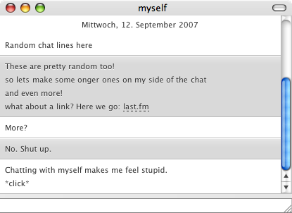
DescriptionSo this is my first release - please be kind with me ;)There are several things that bugged me with most of the other themes:
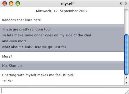
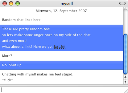
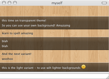
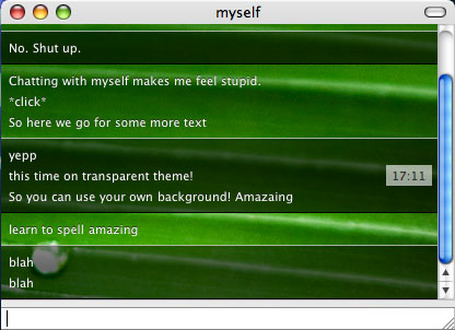
In short: no nicknames, no timestamp! Minimal! There are 6 Variants: Light, Graphite, Blue, Blue Gloss, Pink, Transparent Dark and Transparent Light. Those two latter ones are to be used with your own backgrounds, they have translucent incoming chatlines. Upon request in the WIP-stage I also added optional nicknames - so there are 12 choices :) As this is my first release here, I am hoping for some criticism to make it better! Changes
CommentsYou can reply to individual comments by clicking the "Reply" link next to each. # by otoh on 09/14/07 at 07:37:21This is great! I agree completly with your 3 points, and I love this very minimal theme. I'm using transparent light variant on a white background with 80% opacity and it looks great.
A couple of suggestions: maybe a few variants with transparent colours. And I'd like to see a bit more differentiation with the status change messages (away, idle etc) - maybe in italic? Right-aligned? Paler text? Or even in a paler version of the incoming message panel (It's related to their side of the conversation, after all)? I'm not sure what would work best. And perhaps show the timestamp on these? (But I think hover is fine for actual messages). Anyway, I love it and this is now my default style. Thanks for making it. # by otoh on 09/14/07 at 08:37:28Oh sorry, I thought of something else (you did ask!) When you use a smiley in chat, some styles, eg Smooth Operator, vertically center it in relation to the text (or the other way round) - I think that looks nicer than having the smiley sit on the text baseline. Sorry if I'm being to picky :)
# by csquared on 09/18/07 at 15:54:22Excellent, excellent stuff. The minimalism is nice, but I especially love some of the subtle graphical touches you put in there. The transparent variants are quite elegant.
There is a contrast problem on some of the variations that affects legibility. The contrast between the text and background on the graphite variant seems especially low. Both of the blue variations are difficult to readand maybe it's just me, but I'd like the blue a shade or two darker. Also, on the blue variant, switching to black hyperlinks with normal white copy is a little rough on the eyes; I think going with something like yellow or light blue, or even just white with the dashed underline would work best there. If possible, I'd like to see a variant (or variants) where the incoming text is black-on-white. Studies show that nothing beats black-copy-on-white-background for legibility (maybe off-white, but still), and it would give a natural "pop" to the text. # by csquared on 09/18/07 at 15:58:16Hey, as long as I'm offering up constructive criticism: the pink seems a little too "hot". Desaturate it just a little, and I think it'll be perfect.
# by csquared on 09/19/07 at 19:03:51One more nitpick (last one, I promise): bolded and italicized text renders in Times New Roman, regardless of the font selected by the user (even with the Lucida Grande default).
# by tempques on 09/25/07 at 20:46:42How about an all white nicknames version, with no dividing lines? Shouldn't be to hard to do. =)
# by RockyMontana on 12/17/07 at 23:54:32Oh man!
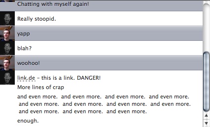
This is just exactly what I've been looking for! It's faaaantastic! The only thing that I have to oppose myself against is the dashed underline on links, except from that, WOW! # by sillyaxolotl on 01/06/08 at 06:54:52I always know who I'm talking to, but I love to see their icons by their text, as well.
I think if you could pull that off, it'd be a great addition to this already nicely-designed style. :D Just my two cents. (I love the wood paneling idea too, by the way!) # by sillyaxolotl on 01/06/08 at 06:56:00Oh, one more thing: I do like the hover time stamp. I think it completes the entire design. :D
# by PrinzAdium on 02/11/08 at 06:09:22Hi! Great message style!
The guys from macthemes2.net asked me to share the mod I made from your theme. So am I allowed release it? Best David # by DBrenz on 05/04/08 at 04:30:02This is perfect and classy! Perhaps it could have a variant that also showed user icons?
# by westcoast021 on 07/11/08 at 08:13:03i'd also like to know where you found that wood background...i'm currently using a different one of my own with the transparent light variant, but i liked yours as well. let us know if u have it or know where to find it! :) love this message style btw, so customizable and always elegantly minimalistic. love it. particular love for the timestamp only on hover...LOVE THAT.
# by zkl on 07/11/08 at 18:55:39Thank you so much :)
http://mt15.quickshareit.com/share/wo...p7a1cf5.gif here you go. This is the pattern I used in the screenshot. # by westcoast021 on 07/12/08 at 00:31:01you're so welcome! :D
the link worked perfectly, thank you so much for the pattern! :) # by om3ga on 08/17/08 at 19:56:15probably the best message-style around. a must for everyone who is looking for class and style!
# by jwohland on 08/26/08 at 14:01:17Darn.. anyone else lose the icon in the header after the 1.3 update? I had it this style set up perfectly a minute ago. :(
# by lukeandrews on 09/07/08 at 20:45:26I wish there was a way to have a blur as a background. So it would still be transparent but blurred so I could read the messages if it is over other text.
# by doubleback on 09/16/08 at 11:43:42Typo?: "2. I also know what I wrote. The interesting thing for me in a conversation is not what the other one writes/says. So I emphasized those lines and dimmed my own ones."
I think that you didn't mean that the interesting thing is NOT what the other one says. Great message style tho. # by leahbasskitten on 10/13/08 at 08:31:21i looove this theme! but there is one css goof in the transparent dark variant. the urls from other people are dark on top of the dark background. here's a screenshot: http://img.skitch.com/20081013-8484mt...nd8uudm.png
other than that, i have no other complaints! # by zkl on 10/13/08 at 16:50:04Hey thanks for your input - I just uploaded a new version where that bug should be fixed.
Be sure to restart Adium after you installed the new version :) # by leahbasskitten on 10/15/08 at 07:30:01w00t! awesome!! sorry for the late reply, i was too busy enjoying it :D
# by norskii on 11/08/08 at 13:26:17This is so beautiful theme! :P I'm a hardcore minimalist, so this is really the only theme I truly love and want to use. Thank you sooo much!
# by Gavvvy on 03/17/10 at 01:04:43Love it, but there's one significant issue: Multiple user chats need to display nicknames, otherwise I have absolutely no idea who;s saying what. It gets really confusing end everybody else in the conversation thinks you're an idiot.
Awesome work, I'd love that fix though! # by roximonoxide on 09/08/10 at 21:20:49I love this one. So nice and simple. I especially like it with the Prequel variant but, I wish I had the capability to alter the secondary color in the Prequel variant from blue to whatever I'd like.
If there is a way to do it and I'm just ignorant to it, I'd love to know how. Post a New CommentYou must be logged in to post comments. |
;)

# by BlackandWhitePenguin on 09/14/07 at 04:12:25
# by zkl on 09/14/07 at 13:54:28