|
GAIA Messageview |
| Submitted By Florian Pichler (pichfl) |
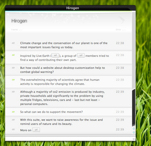
DescriptionExclusive release of the messageview included in the GAIA suite.Graphics by Imrik, updated and reworked by myself. Substyles This messagestyle included several substyles.
Interesting facts
Do not release modifications, personal updates or ports (e.g. to other messengers) without my permission! Adium Set for GAIA You may also want to download the GAIA Contact list. Changes1.0 First ReleaseImagesCommentsYou can reply to individual comments by clicking the "Reply" link next to each. # by caletz on 07/28/07 at 06:37:18how can i put the scroller bar like that :D , without a theme for the entire os x
# by pichfl on 07/28/07 at 10:36:15I use Shapeshifter to change the whole system-theme but you might be able to edit the scrollbars of os x with ThemePark
# by df0notfoundNeue on 07/29/07 at 12:10:14This would be possible if you made the scrollbar using webkit in the theme.
# by Merlish on 08/02/07 at 12:19:45VERY nice theme; even if you use another Full OSX-theme, this still beats the other Adium themes. All hails to you.
# by Reita-sama on 08/02/07 at 18:35:01This is lovely. : ) The only thing I would change would be the icon-size. I'm a sucker for large icons. Other than that, this is perfection. Wonderful job!
# by macaddct1984 on 08/10/07 at 02:05:09Is there a way to disable the images placed over the urls? I don't really like not knowing what it is I'm clicking. Thanks!
# by jimeh on 08/21/07 at 07:31:34very impressive message style, i can't test it atm, borrowing the boss' pc at work while he's out, gonna give it a run when i get home tho :)
# by Cruciarius on 10/21/07 at 20:00:41Very nice, however I really don't care for the status changing messages. They're rather dark and don't feel right to me, since the rest of the message style is white. Maybe a shade gray would look nicer?
# by csquared on 11/06/07 at 14:00:33Quite elegant and, dare I say, groundbreaking. I agree with some of the other comments that there could be a variant with larger icons. In line with Cruciarius's comment above, the black-bar datestamps visually "pop" a little too boldly; softening them with a greyer shade would unify the look.
Excellent, excellent work. # by Junpei on 11/12/07 at 00:10:17I like GAIA low a lot, but my only real complaints are that the margins are just so huge and the time stamps are too big (bigger than the message font size). I could tinker with the CSS myself but I'm not too great at that. :)
# by suzykaploozie on 12/11/07 at 00:35:59I cant get the large header to work for me. The top grey with the user name. Love it, gorgeous, tho.
# by junkiegeek on 06/18/09 at 01:13:54I also cannot get the header to work or show up. It just a giant gap for me when I use it. Other then that is is really pretty.
# by Keitto on 01/29/08 at 18:06:43Nice theme, very elegant!
pichfl, can you tell me the name of your theme? I love it, it's so slick! Please, dude, let me know. # by pichfl on 01/29/08 at 19:24:42You won't belive that it's called GAIA. Sometimes it might be helpful to read what someone wrote into the description.
Enjoy! # by illjazz on 02/09/08 at 04:57:47I dig. A lot! Very clean, very easy on the eyes. Some fancy sliding/fading animations would be cool, a la Renkoo, but I actually prefer the look of Gaia over Renkoo simply because the contrast is far better in the former. The contrast in Renkoo is just.. bad.
Good job on this! # by shima on 08/26/08 at 11:50:49Too bad the away messages are black, if it wouldn't been for that this theme would be great. :(
# by m.rome on 10/03/10 at 04:47:30is there away to add smooth scrolling to the messages? :(
I've no clue how to do it. # by bmoez on 08/24/12 at 03:28:18can i use this theme (main.css + incoming/context.html) on other objects (website, newsletter, ...)?
please what is the licence? # by pichfl on 08/24/12 at 11:53:51Design by Imrik, all rights reserved.
Code by me, all rights reserved. This theme is only available for use with Adium and must not be used in a different context. You can not use this theme or parts of it for other projects, except with written permission by it's creators, which I don't grant any longer. Post a New CommentYou must be logged in to post comments. |


# by BlackandWhitePenguin on 07/26/07 at 17:28:07