
|
iPhone Message Style |
| Submitted By df0 notfound (df0notfoundNeue) |
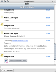
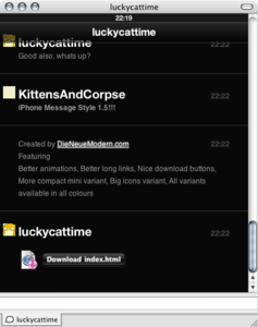
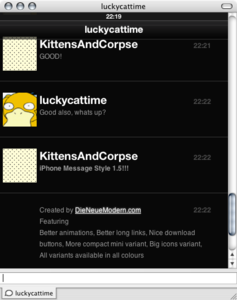
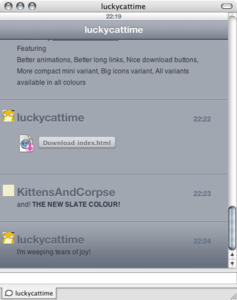
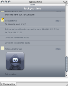
DescriptionInspired by interface design elements of the iPhone, featuring nice simple design but some silky smooth animation.
Idea originally from the MacThemes forum so thanks to ther4ndom for the original suggestion and everyone else there for the support. NOW WORKS IN SAFARI 2!! ChangesiPhone 1.6
iPhone 1.5
CommentsYou can reply to individual comments by clicking the "Reply" link next to each. # by RAPMANkev on 07/09/07 at 09:52:54awesome idea, could need some improvement's tho.
The border's over and under the text steel quiet much space, and the puctures could be bigger, they could be placed under the time or something like that for example... # by RAPMANkev on 07/09/07 at 09:55:59oh, just noticed they get bigger if you click it.
I would really love to see a version where they always stay, like if they were clicked, and with smaller space on top and bottom of text # by df0notfoundNeue on 07/09/07 at 17:14:25I will certainly do a large icon variation for the next release, and I will have a play with closer spacing. The spacing at the moment is important for the vertical rhythm
# by RAPMANkev on 07/09/07 at 09:56:17oh yeah, in my first post, border was the wrong word, it is space
# by lolamione on 07/09/07 at 12:20:48i hope safari 3 wont mess my adium up though.
# by df0notfoundNeue on 07/09/07 at 12:33:09I haven't had a single problem with Safari 3 apart from Microsofts own MSN client.
I am trying to find out what the issue is with Safari 2, its very weird that it doesn't show at all. When it is resolved I will update the Xtra # by Spookster on 07/09/07 at 15:33:381 thing i noticed though: going offline and other status messages from adium don't auto scroll like the messages, which could cause people to miss them. This happens in Renkoo too.
still love the style tho ^^ # by pixelpusher on 07/10/07 at 00:08:55dumb question: why does this require safari 3? do other messages styles require safari at all? is it because it is using safari's frameworks or something?
# by greatcaffeine on 07/10/07 at 01:14:00If I'm not mistaken, Adium uses WebKit to render the message styles. Safari 3 includes a much more recent version of WebKit with new features and fixes. So, to answer your question... yes, you do need Safari for all message styles.
# by df0notfoundNeue on 07/10/07 at 07:02:26Being perfectly honest I don't know why it requires Safari 3 (I had no idea till Safari 2 people tried to use it), there is no reason why it should.
Feel free to poke around inside and if you can get it working let me know, I think its just going to be some silly little difference somewhere. # by marioestrada on 07/10/07 at 17:16:47i like it very much, i reinstalled Safari 3 just try this baby, looks very nice...
My only suggestion would be the scrolling that is very slow other wise it's great! Oh, and the user pictures are to small :S # by tlm2021 on 07/11/07 at 00:15:39It's very very pretty. I like it a lot. My one suggestions is having a variant that makes those boxes smaller. One line takes up a lot of space. Maybe have each line slide in at the bottom of a users section until the other person replies. The iPhone Mini makes the screenname smaller, but the boxes are still HUGE. BUT... I love the idea and am using it already.
# by df0notfoundNeue on 07/11/07 at 07:10:23That is down to the baseline grid, gives it a nice vertical rhythm but rest assured the next version (soonish) will have a slimline variant!
# by pixelfinity on 07/11/07 at 08:45:03When you download Safari 3 Beta it comes with an uninstaller.
When you uninstall version 3 it will install back to version 2... # by RAPMANkev on 07/11/07 at 10:25:23Would be cool if there also was a Variant for tlm2021 suggestion with user pictures that are always, like if they are clicked now.
# by tempques on 07/12/07 at 18:46:04I love this theme, great work. I'd like to request an option to view the iPhone mini interface with no icons if it's not too much trouble. Thanks for the work you've already done.
# by df0notfoundNeue on 07/12/07 at 19:00:22Curses! Forgot to swap those grey ducks for blank images.
I'll add this to the list for 1.5 # by macuser9214 on 07/17/07 at 15:21:06Where is the file to take out (the picture)? I've tried prowling the contents of adium.app and couldn't find it.
# by macuser9214 on 07/17/07 at 15:52:59FOUND THE FIX!!
First and foremost, I put this on all tutorials I give out. This shouldn't harm anything, but if it does, I am NOT responsible.... Now, first, download this zip, it contains two pictures of white (I only did this for the white version, not the black version). http://macuser9214.com/iphone_ad...ium_fix.zip Then in finder, hit Command + shift + G. copy THIS into the box that shows up: ~/Library/Application Support/Adium 2.0/Message Styles/iphone.AdiumMessageStyle/contents/Resources/Outgoing/ Then paste those two files in the ZIP in that folder (it WOULD be ONE, but I got the names mixed up, so I made one for each name, just to be sure). Hit yes, to replace the old file. Do the same thing except change the Command + shift + G line to this: ~/Library/Application Support/Adium 2.0/Message Styles/iphone.AdiumMessageStyle/contents/Resources/Incoming/ Again, copy both files into there. Restart Adium and it should be a blank image now. Again this only works for the white theme. # by tempques on 07/17/07 at 16:57:32Worked like a charm. This'll work fine until the updated release of this style. Thanks again to you and the original author df0notfoundNeue!
# by df0notfoundNeue on 07/18/07 at 21:54:51The next version was going to have blank icons anyway :)
Sorry it was a stupid oversight by me # by Reita-sama on 08/17/07 at 22:10:43You wouldn't happen to have an urge for making a fix to the black version, would you?
# by df0notfoundNeue on 08/17/07 at 22:14:23Fixed it about 2 hours ago in any variation, 1.5 is due out before the weekend is out :)
# by macuser9214 on 08/17/07 at 22:19:42# by Reita-sama on 07/15/07 at 04:55:29Awesome. I've been waiting for something like this for a while now. My only problem is that the user icons could be a tad bigger; it's only really obvious because of the size of the text.
Great job, though. Thanks! # by df0notfoundNeue on 07/18/07 at 21:53:34Coming in 1.5 :)
The user icons currently mimic the list iconography in the iPhone. Hmm maybe I should see if I can find an address book screenshot # by macuser9214 on 07/17/07 at 15:21:59AWESOME theme! I was looking for a modern, yet simple theme, and this is just right.
Oh yeah.. It looks like an iPhone screen :P that's a bonus. lol Anyway, good job! # by unisphere on 07/18/07 at 18:17:12this style seems to totally break jabber chat rooms...i just get a spinning beach ball and have to force quit adium...
# by df0notfoundNeue on 07/18/07 at 21:52:49Sorry to hear that, I'm working on 1.5 this weekend so I will check this out.
# by unisphere on 07/18/07 at 22:34:48cool. thanks.
one suggestion: id like to see multiple messages from the same person WITHOUT a line/time stamp between each message, since adding that line takes up more space and sometimes makes it difficult to follow a person's writing. also, in mini mode i'd like to slim down the size of each message so that a conversation takes up less vertical space. (that could go for the normal mode, too) # by lsaboya on 08/14/07 at 21:32:19Is there a way to make the user icon bigger after I click on it?
# by mrmark on 08/15/07 at 02:16:26first of all: kudos to the designer :D i love it ... only thing i wish to see is that the messages following from one user will be combined in one block. not when one user says two sentences after each other it creates two different blocks ... takes a lot of space ;)
# by unisphere on 08/15/07 at 20:31:43any word on an update?
# by df0notfoundNeue on 08/16/07 at 18:38:00Been busy with my portfolio, But seen as this theme has been way more popular than I could ever have hoped then I will work on an update this weekend.
So get your last requests for 1.5 in :) # by marioestrada on 08/19/07 at 17:14:31One thing/bug i noticed is that it doesn't scroll to the bottom when i get notices, eg. when someones disconnects...
# by Krouton on 08/22/07 at 03:38:15The URL's causing scrollbars doesn't seem to be fixed. I get the problem randomly on links i send to people.
# by df0notfoundNeue on 08/22/07 at 06:12:29Were the links click-able?
only click-able links would be shortened if they were click-able is there any url that causes this every time for sure # by ispytonyv on 08/24/07 at 12:29:33Could you perhaps make variants that don't have a line between each message? It seems extraneous. Otherwise great theme.
# by unisphere on 08/31/07 at 12:46:33group chat is still broken by this style for me..bummer..i'd really like to use it, but i'm on jabber group chat all day...
# by mia on 10/02/07 at 02:09:24I love this message style, but have one suggestion. How about displaying the large user icons in the header, sort of like in bob_the_gorilla's "Big Icons" message style?
# by truemarmalade on 10/17/07 at 16:56:52I was installing and organizing a bunch of new fonts last night, and I've come to find that suddenly all text when I use this theme has turned into some kind of random character gibberish. Do you know what font I may have removed or fouled up that would cause this?
I've tried changing the display font, but none of them make any difference. Help from anyone else who might know would also be appreciated. # by df0notfoundNeue on 10/17/07 at 17:46:26# by truemarmalade on 10/17/07 at 23:18:10Hmm that got rid of the garble, but now any font I want to display is shown as being too closely spaced to read. Maybe I've got too many conflicting helvetica fonts?
# by mrogers on 10/17/07 at 17:30:14I really like this. My only issue is that I don't care for how light the message text is, on the white or dark backgrounds. In the dark versions, for example, it seems backwards to me that the screen names are bright white but the message text is a dull gray. It makes the message text hard to read, and that should be the *most* legible thing on the screen. I'd strongly suggest switching the emphasis: make the screen names a secondary color, like gray, and make the message text flat white or flat black, depending on the variation.
# by caletz on 11/11/07 at 17:50:38hi, could you make on theme, with a large display picture on the header? that would be awesome!
# by satyam90 on 04/29/08 at 10:12:37I downloaded iPhone message style. I am not knowing how to use this?
# by steeze on 05/06/08 at 08:24:52I just love this, thanks so much.
But i have a questions, can i change det font and fontsize for the people i'm chatting with? I have Lucida Grande 10 choosen for myself, but i doesn't change for the no other than me. So my questions is, how do get all the text in the message window to be with Lucida Grande 10? Thanks # by thiagovalenti on 07/23/08 at 17:00:16uh, nice looking, but why does it separates my conversations with a line? shouldn't it separates only when the other person responds?
and why all this wave of chating starting from the top, and not from the bottom? can't you make a setup to start from the bottom? # by creator2456 on 11/17/08 at 20:21:21This fits in with my scheme better than most. Going to keep it for a while.
Great job. # by Yohmgaï on 11/27/08 at 09:42:30I'm using this theme since the day of Leopard, thanks to space. I just changed the size of the fonts and of the personnal pictures to make it really bigger, so it's soooo comfortable. But there is a bug anyway... I can't clic on emoticons to make them appear as text... I also found that if the conversation is too big, it suffers and all the tabs are slowed down (but it's rare).
Even if there is no update since more than a year, I hope you will fix it someday :) Thank you so much for this theme :) # by nashish on 01/20/09 at 19:55:37I really love this style, but I have two suggestions:
Could you make it possible to turn off the message fade in and smooth scrolling? Watching every message I type fade in is really annoying in quick succession. It was a nice touch at first, but got aggravating quickly. Also, you make it so that messages with the same time stamp are grouped? It's also annoying seeing a rule line dividing messages sent in quick succession; I wish they would be grouped like in the default Stockholm style. Other than those things, I think this style rocks. # by ekologik on 02/13/09 at 06:14:09the slate in this makes for an excellent theme. just one thing that kinda bugs me is when one user types more than one line (before the other responds) there's no icon beside any lines after the first, which makes for a large empty space... doesn't look as nice. any way to fix this or at least make in an optional variant?
# by df0notfoundNeue on 02/14/09 at 13:19:02Thanks ekologik, a few people dislike the way the messages group, I am going to release a new version of this theme which fixes this and a few other problems as well as including some new styles.
# by michaeldeol on 03/23/09 at 17:22:34I love how messages group ;) I am excited to see the update. Thank you!
# by sidisnotmyname on 12/21/09 at 07:40:23wow! works perfectly well with my black is beautiful color theme. kudos!
# by aarensmith on 09/27/12 at 08:28:37I love this app.it is really superb app!
iphone application development Post a New CommentYou must be logged in to post comments. |





# by Spookster on 07/09/07 at 09:29:29
i was waiting for something like this :)