|
h4x0r2 |
| Submitted By Sam Aaron (samaaron) |
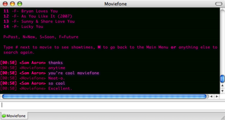
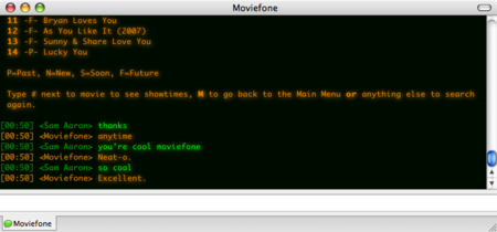
DescriptionThis is just a clean-up and tweaking of the excellent h4x0r theme. This version has been optimised for Safari 3.0 beta webkit (and is untested on previous versions of the Safari webkit), and is a recommended upgrade for those that have the latest Safari but want to keep using h4x0r.I'm interested in expanding this theme with a variety of different colours, so what colours would you like to see? :-) ChangesWorks with Safari 3.0 betaAdded Pinky variation Renamed file to h4x0r2 Fixed buddy icon alignment issue Added bland variant (thanks phunnel) removed blinking cursor in header fixed bottom of message being obscured (thanks phunnel) CommentsYou can reply to individual comments by clicking the "Reply" link next to each. # by samaaron on 06/14/07 at 16:07:54Thanks, although the real credit should go to phrenzy. I've just fixed it up for Safari 3.0 :-)
# by CyberSkull on 06/15/07 at 20:42:55Please change the file name to h4x0r2 so it doesn't overwrite the original style.
# by CyberSkull on 06/15/07 at 20:45:07The buddy icon is misaligned, it is sticking up out of it's box.
# by samaaron on 06/15/07 at 21:47:17Thanks for the hints CyberSkull. I don't use the buddy icon thing, so I hadn't noticed that it was broken. Hopefully it's working as it was (although I wasn't sure how it was working before ;-) ). I've also fixed the file name issue.
# by CyberSkull on 06/17/07 at 00:42:28It's no longer misaligned, but the border on the icon is gone. Also, the old generic is missing. The text wrap is off on this theme as well.
I'm sorry, but I still haven't come up with any color suggestions yet. # by samaaron on 06/17/07 at 06:28:09Is there any chance you could send an image of what it used to look like? What was the border like, on my machine the icon has a dotted red border. What was the generic icon like?
However, h4x0r2 doesn't necessarily have to be a true replica of the old theme. So any suggestions of what you'd like would be appreciated. I've noticed that the horizontal scroll bar appears occasionally, but haven't yet worked out how to stop it appearing at all. If you have any ideas on how I can fix this, then I'd be happy to try them out. # by CyberSkull on 06/17/07 at 06:30:10Same dotted red border for me. As I haven't tried to write a message style yet, I can't offer an suggestions on the horizontal scroll bar.
# by eLement on 09/05/07 at 15:12:06I'll just give you a screen shot of my IM with my buddy with no icon.
It's an Umbrella Corp Icon... http://i19.photobucket.com/albums/b16...icture3.png When the person doesn't have an icon all you get is a lame little question mark. It'd be nice if you could update this with the Umbrella Corp. Icon! # by phunnel on 06/19/07 at 01:10:45I was having a problem where the bottom line of text was obscured by the actual message input box. The following in main.css fixed it.
#Chat { margin-bottom: -10px ; } # by phunnel on 06/19/07 at 01:12:18also, as a personal note, I remove the cursor from the theme, and sometimes the border around the img, depending.
The blinking cursor is very distracting, but the img is a great way to see easily who you're chatting with (if you use head shots for your buddy icons) # by phunnel on 06/19/07 at 01:25:00Also, I created the following variant. Very plain. I called it Bland.css :
I was unable to test all aspects of it, but it's probably very close. @import url("../main.css"); .outgoing .message, .time, .sender { color: #FFFFFF; text-shadow: none; } .incoming .message, .incoming .time, .incoming .sender { color: #3333FF; text-shadow: none; } a { color: #0000FF; text-decoration: underline; } a:link { text-shadow:1px 1px 7px #6bffcb; color: #2afefe; } a:visited { color: #007bff; text-shadow:1px 1px 1px #aa0000; } img { padding: 1px; border: solid 1px #3333FF; } # by phunnel on 06/19/07 at 13:05:18why is it that the buddy icon for the header isn't the same as the per message buddy icon of other message styles. I see that it's a different template key. Adium seems to handle them differently. None of my user set buddy icons on my end seem to take affect. They seem to only be the buddy icon the other user sends me.
# by jongooni on 07/03/07 at 15:13:49I still have the same problem with the weird blurry text. I even uninstalled safari3 and uninstalled adium and the xtra's and restarted the comp and reinstalled adium and h4x0r2 but still same problem. Any idea?
# by Dhraakellian on 08/03/07 at 03:56:38Cool! Kudos from a Kopete user!
This appears to fix the scrollbar problem in Kopete 0.12.1 and later. http://img222.imageshack.us/my.php?im...tyleua4.png A couple questions, however: I'm seeing the name text as cyan. While this is certainly a color I remember seeing on the old Sony SMC-70, it's a tad jarring with the softer green and amber. If this is intentional (and not just some issue with Kopete), could we have a variant with the original colors? Would it be possible to have the buddy icon displayed below the text? As it is (and in the old h4x0r too) the buddy icon obscures some of the chat history, particularly in new windows. (I notice that the screenshots here don't show a buddy icon at all, even a broken image icon. Is that an Adium option?) # by srbradbury on 08/21/07 at 16:13:17Great theme, the best one of this style yet. Only one problem and that is that it doesn't quite wrap the text right. Fix would be most appreciated.
Thanks Sam # by stonematt on 08/29/08 at 17:12:15Since the last update of 1.3, I'm having a different scrolling behavior on open. When a new message window opens, instead of scrolling to the bottom of the window, exposing the last chat session and the new message, it stays pinned to the top, hiding the new message. I have to manually scroll down - very irritating. What changed?
Post a New CommentYou must be logged in to post comments. |


# by tasmanian_devil on 06/14/07 at 15:41:26