|
Ethereal Cloud |
| Submitted By Claudio Marforio (marforic) |
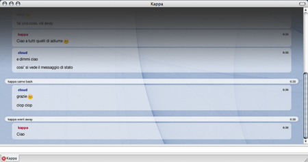
DescriptionEthereal Cloud is a theme that I've put together starting (and just really minimally editing) from Ethereal by Adam Henson, to whom I give full credits for his work.The actual background image is taken from this site - such images is probably going to change over time! This is my first attempt at creating (well, editing) an existing theme, and it served as a hands-on for future development. Restrictions like not giving a custom background and not giving possibility for icon I hope will be fixed with new versions of the theme - need some more time to spend on this, as for the colors of the authors name. ImagesCommentsYou can reply to individual comments by clicking the "Reply" link next to each. # by Querty on 06/14/07 at 08:24:05diciamo però che questo coso non è proprio adatto allo schermino di un ibook 14"...
# by dijama on 06/14/07 at 16:21:17Love the style but 2 suggestions. The header gradient effect that you have is amazingly good looking, but it is very long and you cannot highlight text that is "under" it. I would suggest shortening the length of the gradient image. Also, custom backgrounds would add alot to your theme. Otherwise excellent work.
# by BlackandWhitePenguin on 06/15/07 at 03:50:30This is how I got my start, and now look at me...I'm still editing other people's stuff.
# by ether on 10/12/07 at 06:26:27Hey, I just discovered this :) I approve! Cool idea w/ the gradient.
# by higbdesign on 06/30/09 at 15:16:07beautiful, but the graphic around the away message don't follow the number of the lines of the message.
So, if i have a two line away massage, the second line floats under the graphic element. This issue is also within the message balloon, if the nickname is very long, it overlaps the first or also the second line of the message. Sorry for my english :) Post a New CommentYou must be logged in to post comments. |


# by Querty on 06/14/07 at 08:20:04