|
Quaque extended |
| Submitted By Griflet |
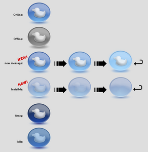
DescriptionFor all who love the Quaque-Icon (http://www.adiumxtras.com/index.php?a=xtras&xtra_id=959) here is a extended version containing a new (animated) invisible icon and a smooth animated transition of the new-message-icon. Take a look at it!Changesanimated new-message-iconnew animated invisible-icon CommentsYou can reply to individual comments by clicking the "Reply" link next to each. # by Chibi on 08/30/08 at 04:09:27Fits in well with the Mac OSX look.
Very well done. In other news... I find it strange (yes, this part of my comment is irrelevant) that nobody sets their Dock to the left or right of the screen; it's always on the bottom. Mine is on the left of the screen and I made it a bit smaller with a little more magnification. It looks very good. Post a New CommentYou must be logged in to post comments. |


# by duckydude1 on 08/01/07 at 14:57:01