|
Grape's Glassy Style v1,1 |
| Submitted By ProGrape |
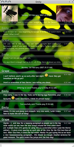
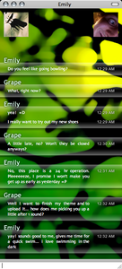
DescriptionThe goal in creating this style was to end up with a very clean look while maintaining ease of use, compactness, and full functionality.Any unneccesarily obtrusive visual elements were done away with, such as message borders (replaced with the more organic look of rounded glass to define the edges) and dividers between successive messages by the same user. The service provider of each member of a conversation is not displayed, as this information is usually unnecessary and can easily be found elsewhere on the rare occasions that it is needed. The colours used for the text (white and bluish shades thereof) provide for a visually simple yet still fully readable message window. Care has been taken to choose a message background that allows a wide range of window background images to be used, from dark to light, while maintaining readablilty. There are subtle shadows around the user names and status/file transfer messages that make them visible even on fairly light backdrops. One of the things I have found lacking in many themes is a good-sized set of avatars. In the future, some text may be added centred between the two and the images rounded at the corners and shaded, but for now the simple look is best. One other small detail is the way that the message text makes room around the displayed time. For the first two lines of text in a message, there is even spacing on either side of the time, and after two lines, the message text comes in below the time, filling the entire width. Enjoy! ~Grape CommentsYou can reply to individual comments by clicking the "Reply" link next to each. # by coerul on 02/26/07 at 21:17:36It works very well on darker backgrounds. On lighter colored backgrounds it ends up looking less clean and clear. Kind of smokey really.
Wonderful job with the spacing though and I love the look. x3 # by itunesmc on 02/26/07 at 22:15:36that theme is great, but could you make the userpics a little bit smaller? ;)
# by The_Tick on 02/26/07 at 23:03:20Rather nice. A way to differentiate between message history and current messages would be cool though.
# by ProGrape on 02/27/07 at 07:43:15Thanks everyone for the compliments and the feedback! I hope you like the improvements in version 1.1, and again, I welcome suggestions for v1.2!
~Grape # by Bleubean on 03/04/07 at 12:03:19Heya, could you please tell me the font you use on the Chat window! its great!
# by wazupjim on 03/14/07 at 00:31:41where it says your screen name, its a little big, is there a way to make it smaller? if you could help id apreciate it
thanks # by ProGrape on 03/14/07 at 15:02:51Yes it is possible to adjust it. I won't change it because prefer the size that it is for larger screens and screens with a dense pixel count, but I will tell you how to do it yourself.
1) Go to your Home folder. 2) Open Library/Application Support/Adium 2.0/Message Styles/ 3) Right-click on GrapeGlass.AdiumMessageStyle and choose Show Package Contents. 4) Open Contents/Resources/ 5) Right-click main.css and choose Open With... Other and then choose TextEdit. 6) Type F and do a search for userName. 7) Inside the curly braces after .userName, you'll see, among others, a field called font-size. It's currently set to 16px, so change it to whatever value you like. Make sure you don't delete the semi-colon after the value, and be sure not to type a space between whatever number you choose and the px (i.e., "16px" will work but "16 px" will not). 8) Save and close! # by ProGrape on 03/14/07 at 15:06:40Oops, in step 6 I had typed the Apple symbol but it was replaced by "". What I meant is, hold the Apple key and type F. Or just look for the only occurence of userName in the document, about 2/3 of the way down.
# by wazupjim on 03/14/07 at 17:02:03i did that but for some reason its not working... it just has the same size, i even went on to the message style that you created and i did that to the message style of yours i downloaded but it still wont work... got any other sugestions?
thanks, Jim # by Needy_Kid on 03/23/07 at 14:20:05hey would you mind posting up your background too? pweese, it too good to pass up?
# by tasmanian_devil on 03/26/07 at 00:50:42awesome! I hope you give a background.. cuz the one you have up there is awesome
# by df0notfoundNeue on 03/26/07 at 16:28:25This REALLLLY needs alternative colours or brightness shades. Otherwise its very nice
# by df0notfoundNeue on 03/26/07 at 16:28:44Alternating I mean
# by ProGrape on 03/26/07 at 18:55:08No, that will not be inculded as it's deemed superfluous.
# by df0notfoundNeue on 03/26/07 at 19:15:31Allows the user to tell if they have been replied to without reading anything, sounds like a pretty huge usability enhancement to me.
And this is coming from a massive believer of simplicity and modernism Honestly, now I'm used to it I can't go back to plain text display, I need some visual signifier either colour or icons next to the text. # by Fruzion on 04/17/07 at 19:40:54"Are you still in the air? You can come straight here when your helicopter lands if you want, or even have them fly here and land in my backyard, my parents aren't home!"
A helicopter! Are you serious!! But anyway, nice theme.... and to all the beggars out there who want the background... make your own. Seriously. No one likes a whiny beggar. Especially after the author has said no. # by ProGrape on 05/30/07 at 19:03:50I received an email from a user who was having problems using my theme in conjunction with ShapeShifter. Has anyone else had a similar problem and found a way to fix it? (I don't use ShapeShifter and I haven't had this problem.) Below is his email. By the way, I'm notified by email of any comment posted here, so there's no benefit in emailing me directly. I'll be replying by comment anyways, as well as posting your email address so that you can be reached by anyone, just like everyone else can be.
On 30/05/07, Ronald L. Rosson Jr. wrote: > When using your theme in Adium with the default variant all my > messages are black in the chat window. I am also using the > shapeshifter theme crystal clear. Do you have any idea what could be > causing this. > > TIA > > -Ron # by ProGrape on 05/30/07 at 19:10:29Oops, the email address has been filtered out. For anyone who wants to reach Ronald about the problem, his email is ron at oneinsane dot net
# by BreakTheChains on 06/29/07 at 23:26:10I've been trying to play around with it a bit so I can get icons inline with each message since I find the header to clutter things up. The problem is that I don't know how to make Message Styles so I can't do it. It would be great if you could add that or at least tell us how to so we can do it ourselves.
Other than that the style is great and I love using it. # by ProGrape on 11/17/07 at 20:54:27This reply is a little late but I'll tell you how to do it. This is how I did it. I think I started out by swapping a few images in other ones that I liked, and then progressed from there. I read the material about creating styles over here http://trac.adiumx.com/wiki/CreatingM...ssageStyles, and I already had some background knowledge of CSS but you will find this tutorial http://www.w3schools.com/css/default.asp very useful. I tinkered and experimented! Just try different things and see how they turn out.
# by scubasteve3715 on 09/18/07 at 01:47:10Hey i have asked this question before in another forum, but how come you cant get rid of the bar at the top of the window? I have a borderless buddy list and i dont know why you wouldnt be able to do the same with the windows. I wouldnt know though so any feedback on how to do this some other way would be great. Thanks!
# by foxswat on 03/11/08 at 12:00:09would you please share the background?
I like it very much thank you # by ProGrape on 06/13/08 at 15:42:31Glad you like it ;)
# by tasmanian_devil on 06/17/08 at 02:53:09Yeah, it looks great with this style. how did you type the apple symbol? is it in special characters?
# by Yoctabyte on 06/26/08 at 21:01:36Either it's just me, but the background has a sharp dizzy contrast between green and black. Nevertheless, it's great :D
# by Swordmaster on 07/02/08 at 13:07:34nice work, it's already my favorite =)
http://img122.imageshack.us/img122/71...917lvf8.jpg - a fine background to it # by jobotslash on 11/24/10 at 23:59:58I love it with opaque background. Gives me exactly what I've been searching for!
Post a New CommentYou must be logged in to post comments. |


# by dcentity2000 on 02/26/07 at 19:24:55