|
Sweetblack |
| Submitted By Mike Reynolds (ecoplex) |
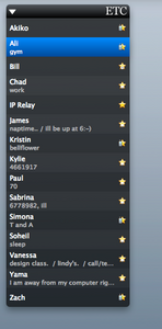
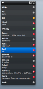
DescriptionThis is my attempt at the "Inquisitor" menu style.I've personally used this list theme for my whole history with Adium. My friend likes it too, and told me I should share it with the xtras community. So I thought "why not?" NOTE: I use 70% opacity in order to give it that nice, clean, yet readable look. I also prefer to use the status icons featured in the previews. (stars & plastik) And as for the Georgia font for the group headers, well, that's my personal taste. :] Do whatever you want with it though! okay, back to tbc.. CommentsYou can reply to individual comments by clicking the "Reply" link next to each. # by jeby on 02/05/07 at 20:48:59cool!! I prefer style with avatar ectc.. but this is a beautiful color set for my contact list! Thanks, five duck! :-)
Post a New CommentYou must be logged in to post comments. |


# by BlackandWhitePenguin on 02/05/07 at 13:25:19