|
Adobe Adium |
| Submitted By rob hidalgo (luegopasa) |
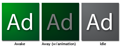
DescriptionSo... I have really mixed opinions about the new Adobe CS3 icons, but the PS one seems too lonely down there by itself. The color suits both Adium and it's not yet used by any of the CS3 applications. The upcoming icons are here.Cheers! Images CommentsYou can reply to individual comments by clicking the "Reply" link next to each. # by BlackandWhitePenguin on 02/04/07 at 01:51:51Simple and clean. Looks like it belongs on the periodic table. Nice job.
Post a New CommentYou must be logged in to post comments. |


# by michelebugliaro on 01/19/07 at 21:33:08