|
AntiPropaganda |
| Submitted By Oskar Krawczyk (oskar.krawczyk) |
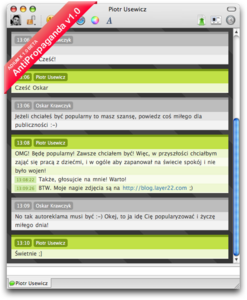
DescriptionHere is the first revision of AntiPropaganda Messages Style for AdiumX IM. The whole idea was inspired by MyPropaganda weblog.I'm working on a enhanced version of AntiPropaganda, with loads of JavaScript features, ie. SingleClick Quoting, live searching, avatar view and more. Stay tuned. ImagesCommentsYou can reply to individual comments by clicking the "Reply" link next to each. # by enkuturi-akrias on 01/14/07 at 19:35:04jaja ta weno. i like it. hablas español? yo soy de chile
# by oskar.krawczyk on 01/14/07 at 19:47:08Thanks guys for the thumbs-up!
@enkuturi-akrias: sorry there mate I don't speak Spanish. # by Yohmgaï on 01/14/07 at 21:14:58Very good theme (like the blog) I'm really impatient to see what you''l do next ^^ but I have a problem with your theme... here is a screenshot of what it does in my own chat window : http://yohmi.free.fr/bordel/antipropa...datheme.png
As you can see, stripes are not collapsing with text... is there any way to fix that but formatting text ? thanks a lot :) 4 ducks because of this problem, but it's still a nice and colourfull theme :) # by oskar.krawczyk on 01/14/07 at 21:25:36Well that happens when you use custom fonts/colours my friend :-) Originally the theme was developed for Lucida Grande 12. So just double check in your preferences if that one is set correctly. And also... well you might want to turn off custom font for incoming messages.
One more thing, regarding emot's - personally I don't use them so dunno what will happen to the style if you get a big-ass emot :-) # by bladdo on 01/14/07 at 23:14:36Amazing job man, I signed up just to comment on this one. You should make a matching buddy list to go with it. Just amazing, best work I've seen on adium message windows.
Thanks, bladdo bladdo.net # by Mxwllsmrt4 on 01/15/07 at 17:02:33sweet message style bud.
more colors would be sweet, can't wait for updates. way to go. # by skoo402 on 01/16/07 at 11:57:55Easy on the eyes. I like it.
More color variants would be a plus. # by rob1n on 02/28/07 at 13:51:43I really like this message style, disabled the emoticons for using it, but i still have the same scrolling bug as 61Tipo61 sometimes. Anyways, a matching contact list theme would be awesome!!
# by TwisterMc on 03/20/07 at 13:00:32I love the theme, but have a bug. When there are only a few messages in the window, the bottom one is cut off. Once there are enough messages to fill the window, and one goes off the top, then it all works great. http://i150.photobucket.com/albums/s9...icture1.png
# by oskar.krawczyk on 03/20/07 at 13:04:55Thanks for the info TwisterMc - will address the problem in new release.
# by rcx on 05/02/07 at 17:15:15I like this msg style, but unfortunately it's
unusable, you can't see the last line of the conversation (with emoticons, fonts and colors enabled). Hope you fix this soon. # by mathuaerknedam on 11/30/08 at 21:24:04What's the status of the in-progress "enhanced version" mentioned in the description?
Post a New CommentYou must be logged in to post comments. |


# by 61Tipo61 on 01/14/07 at 17:22:52