|
Darkly |
| Submitted By Michael Flux (InkMaster) |
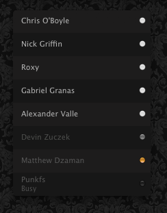
DescriptionStyle I made for myself, but since everyone to whom I showed loved it so much, I decided to post it here.Looks best on dark patterns - like that in the screenshot. Use this style with 'dia status icons' specifically 'dia b&w on black'. Don't forget to install MenuShade to enjoy all of the dark bliss. Images CommentsYou can reply to individual comments by clicking the "Reply" link next to each. # by mike on 12/16/06 at 09:06:13hello, I'm a fan of your theme - it looks great on that wallpaper. Where did you get the wallpaper from? Can you provide a download link to it?
Thanks # by InkMaster on 12/16/06 at 14:07:06Its not really a wallpaper; I'm just subscribed to RSS feeds from about 50 design blogs, so whenever I see any cool pattern anywhere, I just cut it out as I did with this one - I don't know who made the original - but here, I uploaded the pattern for you http://inkspill.net/dark_flowers.png - enjoy :)
Post a New CommentYou must be logged in to post comments. |


# by monkeapple on 12/13/06 at 03:33:05
Thank-you
# by xSpikex on 12/13/06 at 11:39:35
but the List Style looks great :)
# by InkMaster on 12/13/06 at 19:15:37