
|
Chromo |
| Submitted By df0 notfound (df0notfoundNeue) |
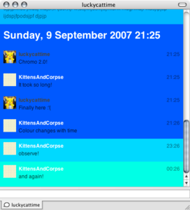
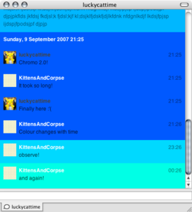
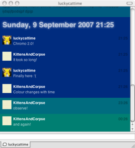
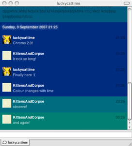
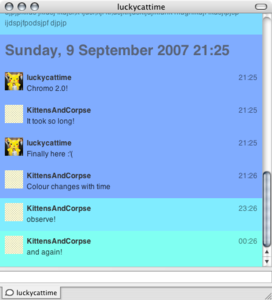
DescriptionAn idea I wanted to create for some time, this message view uses the background colour of each message to show what time the message was received. This is based on the work from Chromo.The effect is a slow change in colour as time passes, so you can tell when its getting late because the background is getting turquoise! Anyway nice simple theme that keeps fresh with its dynamic backgrounds. Changes2.0
CommentsYou can reply to individual comments by clicking the "Reply" link next to each. # by AzrimEkim on 12/05/06 at 06:34:05Great concept, but the colors are pretty strong; they hurt my eyes. Maybe experiment with subtler tones?
# by df0notfoundNeue on 12/05/06 at 19:04:04Next version will have a 50% lighter and 50% darker version :)
hopefully done by the end of next weekend! # by kerry on 12/05/06 at 21:51:17Really like the idea... maybe add a version where it's a dark background (black maybe?) with the text changing colors. I've always liked a bright text on a dark background, so this might turn out really neat with them changing.
# by df0notfoundNeue on 12/05/06 at 21:57:46Can't believe I didn't think of that :) considering I did the coding in a text editor with bright colours on off-black :)
This might have to be a different theme, unless I can figure out some Javascript smartness # by hoefkade on 12/07/06 at 10:38:11maybe you can only use shades of the same color.. so from light to dark or something
# by taids on 02/18/07 at 21:57:43Is it just me or does this style cause the message window to flash white and then scroll all the way from the top back down to the bottom every time you send/receive a message? I find after about 20 lines it becomes quite slow too. The white flash is nauseating...
I presume that's not meant to be a feature, right? # by electronicpretz on 02/27/07 at 16:05:50This is a fascinating experiment. I'm using it with great interest. And the colours are really glorious!
# by tasmanian_devil on 03/31/07 at 04:59:15awesome! some1 needed to make something that could be seen!! :D LOVE IT!!
# by kevindesignpirate on 05/14/07 at 20:13:51I really like the concept. It would be sweet if there were a color theme included that was comprised only of CMYK
Pretty please? # by SamGwilym on 09/02/07 at 10:57:59Update already! ;)
# by kmccormi on 10/03/07 at 15:51:282.0's colors are wrong. Don't match chromo.org at all.
# by kmccormi on 10/03/07 at 15:53:39I'm an idiot - sorry about that. The default color when I switched message styles was orange. But when I sent a message it changed to the correct color. Good job!
# by kmccormi on 12/05/07 at 13:51:08Actually, there is a bug ... at least on my end. From 9am - 10am, the color is a bright aquamarine ... then at 10 it all of the sudden changes to orange and then fades correctly through the colors throughout the rest of the day. But that 1 hour of aquamarine really bugs me ... and definitely doesn't match the orange-yellow for that hour on chromo.org.
Post a New CommentYou must be logged in to post comments. |





# by evands on 12/03/06 at 16:14:56