|
GuruMod |
| Submitted By Alex Martin (lostguru) |
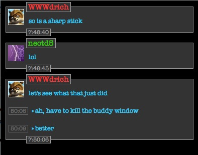
DescriptionMy first message style. This was one of the first things I made when I started using adium. That was a year or so ago and I've finally got it looking right, and now it is ready for the world. Have fun!Changes2.0:First major updated release. New lighter variant as well as fixes for a lot of smaller bugs. 1.0: First version ready for the public! Images CommentsYou can reply to individual comments by clicking the "Reply" link next to each. # by MercuryGlitch on 10/31/06 at 00:27:36Nice, I agree with the above though, minimalization of this theme would be great. If you want a good example check GoneDark. Though I prefer your color theme, GD's general layout is nicer (IMO).
Would be nice to see a combo of those two. The timestamp within the message is weird without the hour. Post a New CommentYou must be logged in to post comments. |


# by Mxwllsmrt4 on 10/30/06 at 02:20:44
you should try different colors and minimal style mod.
cool though.
# by lostguru on 10/30/06 at 04:12:14
im currently working on a light version as well as a few bug fixes and other minor changes
check out the gurumod contact list style