|
Dark Chat |
| Submitted By wowstanley |
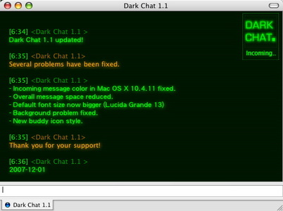
Description[Dark Chat] Message StyleI always like this kind of terminal interface. "Dark Chat" is inspired by phrenzy's message style h4x0r. I made my version more legible. Sometimes your friend's screen name is so long that you don't know where the message starts. So I separete name and message into two lines in my version and change some details. Hope you like it! Download Contact List Style ChangesThank you for all the feedback. Dark Chat 1.1 is released. Several problems have been fixed.Dark Chat 1.1 - Incoming message color problem in Mac OS X 10.4.11 fixed. - Overall message space reduced. - Default font size now bigger (Lucida Grande 13) - Background problem fixed. - New buddy icon style. - Release date: 2007-12-01 CommentsYou can reply to individual comments by clicking the "Reply" link next to each. # by carboncopies on 08/24/06 at 10:21:07yah i really like i man, but i do agreen if you could tighten up the lines that would be great. to much negative space so i have to scroll to much
# by wowstanley on 08/24/06 at 12:54:28Thanks for the advices. I'll try to fix it next version. Space and legibility surely need to be balanced.
# by enkuturi-akrias on 10/24/06 at 13:30:38very cool! is like terminal!
a good idea is adding a glowing effect in the lines and/or names or something and adding green lines like a background # by adium on 01/04/07 at 22:31:36i think u should also make a font to go w/ this, like a digital one, like the one above the preview
# by andrewpandji on 02/19/07 at 05:20:35oh can you use the above font including the beeping effect too. Also try using the lines effect on top of user pic like the Metal Gear Solid mod. Make it seem clean like a dark interface. With all green text and an occasional binary code or something like that flashing on top. Moving sideways...
# by andrewpandji on 02/19/07 at 05:24:12maybe make it so that the above text can be ued for example someone messages you there is the writing INCOMING TRANSMISSION including the fade effect.
# by itasara on 06/23/07 at 02:56:46I love this theme, but I can't see the responders message unless I stick my nose right up to the screen. The color is light and a bit fuzzy. Would like to try a more vibrant color.
# by srbradbury on 08/18/07 at 17:44:23Wow, great feem. Thanks a lot. The font colour of the other person could do with being a bit clearer, can barely see it if their font is set to black. Other than that, awesome!
# by rutiger on 11/15/07 at 22:24:55any chance of getting this to work with safari 3? i've tried numerous message styles and this is by far my favorite but stupid safari 3/webkit broke it.
thanks # by js1 on 11/26/07 at 20:54:03After OSX got upgraded to 10.4.11, all IM's received have black text which doesn't show up so good against the black background. Anybody else experiencing this? Is there a fix?
# by klank on 11/29/07 at 18:57:58yes jsi I have the exact same problem here
after the update the all received IM come in black text. plz wowstanley can you fix this? I can change the font of the incoming text but I can't change the colors I hope that you can fix this. it's the only style I actually like to use! anyway thnx # by wowstanley on 12/01/07 at 10:49:06Hello everyone, thanks for all the comments. I've fixed the incoming message problem. The color is normal right now. Message space is tighter in version 1.1. Hope you like it!
# by VirtualAlex on 12/08/07 at 08:03:56This is an excellent theme. I love how the text seems to glow a little on the black background. Excellent work.
# by Rmax on 01/06/08 at 09:18:17Very cool tank's
It's possible to have a version with 2 user icons ? on top # by kcariad on 02/02/08 at 23:16:43I'm really glad that you made this because when Safari 3.0 broke h4x0r, it sucked. I was wondering though, if it would be possible to bring back the text glow that was used in the original?
# by hyposonus on 06/02/08 at 01:51:31I'm still having the incoming text problem. I see the glow, but not the actual text, and it's still very hard for me to see the other person's text. Although I do like it better then h4x0r. Please help me.
Post a New CommentYou must be logged in to post comments. |


# by fissure on 08/18/06 at 15:31:57
I think it would look nicer if you tightened it up a bit (i.e. remove extra space), but that might make it less legible...