|
iBubble 3 |
| Submitted By Iiro Jäppinen (Iiro) |
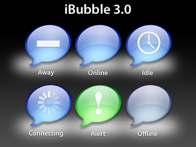
DescriptionIntroducing the iBubble 3.This version is strongly inspired by Apple's upcoming OS X 10.5 iChat. But don't let it bother you. At this point the other states don't have differently colored bubbles. This is in order to make it more pro-like (for me). So please enjoy. The connection and message alert animations are basically the same as in the last versions, just redefined for better looks. Also file size is a bit smaller (I think), this time I used overlays! One thing about the overlays: When your status is set to away, and you get a new IM, both the away retangle and new IM notification will appear. But that doesn't bother me. If it's brutal for your existance, I can fix it. Thank you. :-) Important: This time, don't rip my icons. If you want to use it for making a custom dock icon, please ask for a permission before publishing it. ChangesVersion 3.2- Fixed the plist file to work with changes of version 3.1 (I forgot to disable the overlay status for away & idle state). :-P Version 3.1 -Fixed the overlay problems: Not using overlays for different states anymore. ImagesCommentsYou can reply to individual comments by clicking the "Reply" link next to each. # by kjdenison on 08/14/06 at 23:26:32Is there any way that you could make a variation of this icon to replace ichat's icon?
# by csquared on 08/14/06 at 23:33:42Staying with the cool colors (as opposed to the traffic colors in earlier versions) really unifies the look. And these icons look even more Aqua-lickable than Apple's official work. Excellent, top-notch work.
# by Corny on 08/20/06 at 14:02:07Awesome work, but not this Pro-Style is not my taste. I liked these "childish" colors of 2.0 more, but hey, awesome work and 4 Ducks for it :)
# by shahrum on 09/03/06 at 02:21:17When you are idle & away you get the clock for idle with a bar over it for away. Can you make it set so that it only uses the clock and doesn't put the bar over it? Often times I'll really be using the computer but use Adium's 'appear idle immediately' to fool friends that I'm not really here! Thanks!
# by 100GBiPod on 09/05/06 at 18:15:55I really like this a lot, simple and pretty. However, I wish there was this exact icon, only mirrored left-right.
Either way, awesome! # by Daniel on 09/10/06 at 17:24:46Great icon, nice work!! I think its a bit high among the other application icons in the dock, so if you would make it a bit lower, or contract it.. but its great! :)
# by skball on 01/02/07 at 23:37:56wow! this has come very far and is amazing! 5 ducks all the way!
# by lightxs on 03/28/07 at 23:27:35WOOT! It looks real nice! (OK, bad choice of words. It's MUCH better than "real nice"!)
# by duancg on 05/01/07 at 19:35:44Beautiful! Could the bubble be a bit smaller and the tails be a bit bigger? That way it look even better from distance. Nice job!
# by jrennell on 07/26/07 at 20:53:09This is an excellent iteration of the iBubble icon. I very much like the idle and notification state icons. I always like the iChat dock icon because of it's simplicity and you captured it for use with Adium. Great work! (Also thanks for fixing the overlay issue)
Post a New CommentYou must be logged in to post comments. |


# by shahrum on 08/14/06 at 23:07:05