|
Perfection |
| Submitted By Derek Costa (DCosta) |
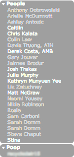
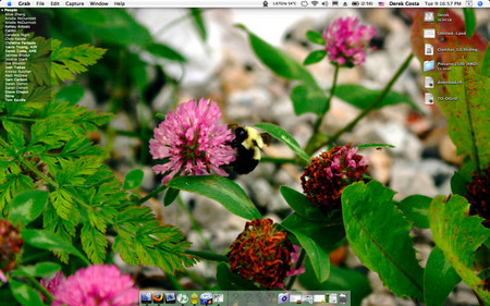
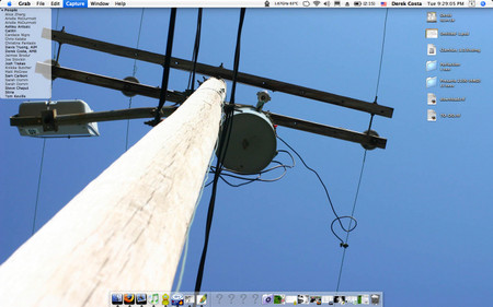
DescriptionA very minimal approach. No user icons, no status icons, no clutter. Text and background color tell you everything you need to know. Enjoy.In the original version: Online & Available: white text w/black BG Online & Unavailable: gray text w/black BG Unread Message(s): flash between current state (available or unavailable) & white BG w/black text Online/Offline Transition: white BG w/black text In the inverted version: Online & Available: black text w/white BG Online & Unavailable: gray text w/white BG Unread Message(s): flash between current state (available or unavailable) & black BG w/white text Online/Offline Transition: black BG w/white text For optimal appearence, set the following: Original Window Style: Group Bubbles Opacity: 42% List Width: 150px Scale to fit verticaly: on Inverted Window Style: Group Bubbles Opacity: 59% List Width: 150px Scale to fit verticaly: on Screen shots 1, 2 & 3: Original Screen shot 4: Inverted Please excuse the "Poop" group. That was only put there do demonstrate what multiple groups look like. I took new screen shots so you could see the lists on a full screen, without the blurring of everything. The wallpapers are my photography. E-mail me if you want one. A full gallery is available at my site. Changes1.0.3 Noticed the colors were a bit off in the inverted version. Fixed.1.0.2 Added an alternate color option. 1.0.1 The colors were off a bit for the going off line action. Fixed now. 1.0.0 Initial release. CommentsYou can reply to individual comments by clicking the "Reply" link next to each. # by krysia322 on 07/04/06 at 12:51:45I love it. Don't suppose there's a matching message style? :-)
# by DCosta on 07/04/06 at 17:19:02I am working on it. I'm new to the xtras for Adium, so give me some time. I'll do my best.
# by DCosta on 07/06/06 at 10:50:03I just changed my mind. I have been using the Minimal message style that comes bundled with Adium for the longest time, and I find that it goes with this list theme quite nicely. I couldn't come up with anything better; the best I could do for you is make a grayscale mod of the Minimal message style.
# by midjetville on 07/27/06 at 08:50:46i noticed that you were thinking of a message style that goes with this. i am working on a BLU22 message style which is basicly free-floating text on a 20 percent opaque surface. no huge windows, just a flat surface which text freely floats. its turning out well, but its very difficult as i have never done this before lol. ill let you know when it is finished!
# by littlebluerobot on 09/05/12 at 16:49:02Simple and clean, my favorite. (I downloaded this and it said "200% Complete" which was also kind of amazing.)
Post a New CommentYou must be logged in to post comments. |


# by DCosta on 06/30/06 at 22:50:56