|
Metal Chat 2 (AvG remix) |
| Submitted By Adrian von Gegerfelt (AvG) |
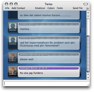
DescriptionBased on Metal Chat 2 originally submitted By David Legnon (mr_misanthropy)I've added timestamp in the name header, previous conversations transparent and in grey, and three new styles: Red & Violet, Aqua & Graphite and Black & White Service icons by Peter Simonsson (pss) from the set pss-2 Service Icons Changesv 1.1.5: Fixed a mistake I made with the incoming/outgoing colors :Pv 1.1: Added service icons in grey in upper right corner. Thanks to Marius_Th for the code CommentsYou can reply to individual comments by clicking the "Reply" link next to each. # by AvG on 04/16/06 at 16:43:31I'll think of a way to show the client, without having to redraw the original work :)
Did you mean a hovering image if you put the pointer on top of it, or did you mean very large images at the top of the window? Thnx 4 the credz! :) /AvG # by Eaglelouk on 04/16/06 at 17:51:21It would be great if you could place an header...
Seeying users icon on every post in a small size is very ... useless :p # by AvG on 04/16/06 at 18:04:19For a header, just check the "show header" button in the message view preferences. Thought I might put the user icons there too. But I like having the small icons where they are, that's why I chose to mod David's message view. The icons in my contact list are just as big.
# by RAPMANkev on 04/17/06 at 13:35:51My Idea:
You click on the usericon, and than it shows you zoom in it. so if you click once, it is maybe 2x zoomed If you click another time it is 3x another time it is 4x another time the zoom is away. lg' Kev # by Marius_Th on 04/18/06 at 12:25:09how about adding user icons to the far and upper right of every IM by adding the following line in HeaderIncoming in the Contents HTML:
(Ofcourse, don't forget to put the protocol images in the right directory) Note: this is an older mod i did for private use, and would love to see this in a release so i wouldn't have to go trough the trouble of modifieing it myself ;) # by Marius_Th on 04/18/06 at 12:40:01Bleh, putting an HTML code line on an HTML page doesn't work too well ^^;
# by Marius_Th on 04/18/06 at 12:51:07sorry to make so many replies, but this picture will give you an image of what i was talking about: ^^;
http://img221.imageshack.us/img221/88...ure15ep.png # by RAPMANkev on 04/22/06 at 13:13:46hmm, the .Mac icon is 2times bigger than ICQ and AIM :/, and it would be nice if you could use the pss-2 icons.
You can find them on XtrasPage. (use search function ^^) lg' Kev # by RAPMANkev on 04/22/06 at 13:19:57Here is the Xtras with the zoomable icons by the way, maybe you can support that in your Xtra too:
http://adiumxtras.com/index.php?a=xtr...tra_id=2682 And here are the pss-2 service icons: http://adiumxtras.com/index.php?a=xtr...tra_id=1955 would be awesome if that stuff could be in your great Xtra too. lg' Kev # by michelebugliaro on 04/23/06 at 15:01:43Wow, very very good xtra, deserved be included with 1.0.
# by crazy on 01/28/07 at 21:58:105 ducks!
I loved MetalChat2 and this pretty much fixed my only gripe with it. The only problem is there's not initial time stamp with people with really long display names, but thats extremely minor. Virtually perfect :) # by scubasteve3715 on 05/13/07 at 01:41:15this is great. however im really gettin sick of the bar at the top of the window and the bottom and wish it would just go away. also the scroll bar arrows and track are gettin annoying. maybe you should make the top bar and scroll bar track 100% transparent or just hide them when the mouse is not on the window. i have a list of transparent bubbles for my buddy list and it would be great to get something like that. great xtra though
# by AvG on 05/13/07 at 09:07:45Thanks! though I can't remove the GUI components like scroll bars and title bars, you have to find a 3rd party application for that (which then, perhaps, removes all scrollbars in Mac OS)...
# by scubasteve3715 on 05/13/07 at 11:27:15gotca
# by scubasteve3715 on 05/13/07 at 11:41:42Hey dont mean to bother you but btw do you know any free theme changing apps for mac?
# by paddster2761 on 06/03/07 at 18:08:53Is there any way you could update the service icons displayed in grey in the upper-right corner to the new icons used by the services (as shown in the Service Icons section of this site, in a file called Up2Dae Aqua 3.4)? Also, could you make the icons color instead of grey. The icons are so small that it is difficult to identify them when they are grey.
Thanks for the consideration. # by Yannoux on 11/24/07 at 06:15:33Good work AVG !
So, can you put the time stamp and service icons under the user icon ? it will be good, more visible. One more thing !!!!!! lol -- Contact style with Metal Chat style to? it will be amazing ! @+ # by Glorp on 04/06/08 at 21:32:36Awesome. Fixed the problem with the original MetalChat2's not greying old chat.
Although, Can you have chatstyles that DON'T have the little grey service icons? Also, it isn't needed to have seperate styles that don't have a header (since there is an option that takes away the header). Post a New CommentYou must be logged in to post comments. |


# by RAPMANkev on 04/16/06 at 16:09:27
that was what I searched for...
Would be great if you could place the client at the right side of the bar where the name is in.
And it would be also awesome if there was that picturezoom thing, wich was in a messagestyle a few days ago.
lg'
Kev