


|
SPeCks |
| Submitted By Terry Tolleson (tamashii) |
DescriptionThis is my first Adium Xtra. And what better subject to use than my very own SPeCks. This here's Bob.The Dock Icon has all the states covered: Awake/Preview, Away, Asleep/Base, Connect, Alert and Invisible. As you can see, most of them have an animation (Away's is subtle). Depending on how well Bob goes over, I might consider doing one for each of the characters. I am already working on trying to formulate the Contact List and Message List styles. Tell me what ya think! And most of all Enjoy!!! -t Images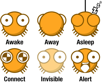    CommentsYou can reply to individual comments by clicking the "Reply" link next to each. # by vip on 04/12/06 at 23:53:58I like it, but it's rather small... seems VERY OUT of place on my dock :( anyway of making it even with the other icons ??
# by tamashii on 04/13/06 at 00:00:56Well... I honestly didn't know it was going to be set so low until after I finished the whole set.
I will be cleaning up some of the animations and also try to bundle a menubar set, so look for the height/size fix in version 1.1. Thanks for commenting! # by cosmosheep on 04/13/06 at 00:23:40I really like this icon - I've got the same suggestion as vip - I'm looking forward to version 1.1!
# by morethanthesky on 04/20/06 at 16:59:07Love them! I can see the too low thing, but they dont seem small to me.
Thanks for making these for us! You're the greatest. # by cheezitimposter on 02/15/07 at 01:59:4810 duks!!!! XD
# by tasmanian_devil on 04/22/07 at 04:41:52I like ur name!! and plus Umm I love the dock icon!!!!
# by cheezitimposter on 04/25/07 at 02:09:35were u talking to me? if so... what dock icon r u rfrng to?
# by tasmanian_devil on 04/25/07 at 02:19:45I am talking to u about ur name and I am saying that tamashii's dock icon is cool
# by bombchu on 10/02/08 at 12:52:22I love it. I've already installed it~ The only thing is I'm thinking of I'd like th' line around the mouth to be a bit thicker. There's a super big contrast between the outline around the rest of him, and maybe that's what you were going for... but that's just my thing lol
Btw, why don't you have any vector characters in your portfolio >.> lol # by tamashii on 04/08/09 at 19:19:15As for vector characters in my portfolio, I have a very few actual character studies. One is SPeCks which I haven't done anything on the comic or anything for several years and the other notable one is YellOh which is only seen in a desktop download (Where's My Pickle!). There are other studies I have done, but as my career is in graphic design in general, I don't include those in my portfolio section. The Lab section, however, I might start putting more in there. Thanks for the suggestion! # by luizamendes on 04/02/09 at 23:36:37It's cute, but one thing i didn't like: when you hover the mouse, and it gets bigger, there are some white pixels that bother me...
# by tamashii on 04/08/09 at 19:19:25I'll be honest here folks this Xtra got away from my priorities list and completely off my radar.
I really want to make an updated version now after revisiting this page and reading all the comments. Just amazing it has received so many downloads! Of course, I'll have to relearn the process to make these things (I think I may just have to update the imagery, really). I'll be looking into the "sit height" for it. Ultimately, it has the same baseline as the other icons in the dock, so I am not sure what kind of fix is in order. Regarding the size of it, SPeCks are tiny spiders afterall, so I think I'll keep the size consistent. @bombchu :: The mouths on the spiders use a decidedly thinner stroke. However, I understand the issue presented when they are used in the context of something like a dock icon. I'll see about bumping that thickness up a bit more so the contrast is a little less in-your-face. @luizamendes :: when I created this three years ago, I don't think I understood much about the alpha channels and transparency options available to me for such a project. I'll definitely be testing the new version to have much cleaner edges. Thanks to everyone for your feedback and comments! It really makes me want to get back on this project and improve it; in addition to adding the other items I considered such as the theme and menubar set. Post a New CommentYou must be logged in to post comments. |

# by m2e on 04/12/06 at 22:29:58