|
Modified Seph Status Bubbles |
| Submitted By apathy (kndnice) |
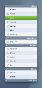
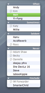
DescriptionI made four changes to Seph's fantastic icons:1. Available icon is blank (simplifies UI) 2. Idle icon is different than away icon (cuz i like to know) 4. Created a mobile icon. 3. All icons are dimmed to match dimmed names. This modified icon set makes it very easy to visually separate available contacts from unavailable contacts without requiring one to sort by availability. Sorting by availability reduces predictable contact locations (e.g. suzie always comes before xavier), but improves ability to distinguish available from not available. This icon set allows one to preserve static ordering (last name, etc.) while improving the ability to distinguish available from not. Thanks to Seph for all other icons. Changes4/2006 - Added icons: mobile (mine) and invisible (just used seph's offline icon)3/2006 - Just made an easily installable version. 12/2004 - Initial release. CommentsYou can reply to individual comments by clicking the "Reply" link next to each. # by kndnice on 04/03/06 at 19:50:57updated: added mobile and invisible icons.
# by mathuaerknedam on 04/04/06 at 11:57:50Thanks for adding an icon for invisible. :) But now invisible and offline have the same icon. Which is better. but not ideal. :(
# by kndnice on 04/04/06 at 15:12:03what is the point of the invisible icon? the only place i can see it is when selecting a status from the drop down. obviously i wouldn't see it in the contact list as anyone that is invisible is shown as offline anyway.
# by mathuaerknedam on 04/04/06 at 15:18:36The status menu is exactly where I use it.
But to be honest, after using this extra for a while I don't think it will replace what I've been using. So don't add it just for me. (Though you may want to just for completeness...) Post a New CommentYou must be logged in to post comments. |


# by vip on 04/03/06 at 06:41:20
# by kndnice on 04/03/06 at 12:57:40