|
LithoMilk |
| Submitted By Dan Keezer (dankeezer) |
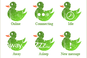
DescriptionThis icon set is ripped directly from both the popular Milk icon set for Adium by Rasmus Andersson and the LithoSystems set by Anthony Piraino. I found the duck icon though, hah.Version 2.0 Update Redesigned all status icons with transparent elements (instead of dark green). Incorporated new "asleep" and "away" text elements. Version 1.2 Added "New Message" indicator to menu bar icon set. Added "Offline" menu bar icon. Other stuff ripped from Rasmus Pulsating (animated) exclamation point when you get a message. Animated "Conntecting" icon. Bundled Menu Bar icon. So if you're like me and need the Litho icons in your dock to match than this may make you happy. Thanks Rasmus and Anthony for the inspiration!! CommentsYou can reply to individual comments by clicking the "Reply" link next to each. # by dankeezer on 09/25/05 at 17:07:52Thanks, I may come up with some original status icons in the future if there is enough demand, let me know!
# by zaudragon on 09/25/05 at 23:47:01The status icons idea is pretty cool. Make some other things too ;)
# by MsSolberg on 12/30/05 at 17:02:54the idea is good, but this is a really bad presentation of it. be more creative ;)
# by caseysousa on 07/06/06 at 19:42:08Really? You think it's a bad presentation of it? I think he's done a very good job.
My only suggestion would be to use a default duck shape instead of this one. I can't quite picture it, though, so maybe this one is the better of the two. # by cz1190 on 05/18/06 at 17:36:04Can someone please tell me how to make the dock look like that one?...I have Transparentdock..but I can't find the setting for the icons like that..
# by caseysousa on 07/06/06 at 19:38:53I'm pretty sure those icons in the screenshot above were created individually by dankeezer. TransparentDock doesn't have the ability to change your icons into lithographs. :)
# by mollyemo on 07/07/06 at 11:13:34Yes, where can we get the other icons like this?
# by caseysousa on 07/07/06 at 14:45:25i just spoke with dankeezer and found out that the icons are downloadable from http://iconfactory.com/SearchListing....query=litho
# by dankeezer on 07/10/06 at 17:53:15That's right. I can only take credit for the construction of the Adium icons. Anthony Piraino is the artist behind the others, and you can find all of his icons at the iconfactory link above. I'm glad you guys like it. I need to make a newer version that has a better default icon, it is slightly discolored before you open Adium... I'm not sure why it does that.
# by mollyemo on 07/10/06 at 21:11:16Could I make a recommendation for the next version? I think it would be really cool if your icon was slanted like the rest of the Litho icons.
Re the P.S. below: Yeah, I saw the icon in Vol. -- I think it was 3, definitely not 4 -- and I stuck with yours for exactly the reasons you mentioned. :-) # by dankeezer on 07/10/06 at 17:58:29P.S. Anthony actually came up with his own version of the Adium icon. So you can choose which one you like better when you download Vol. 4 (i think). His isn't animated though, nor does it have 6 different status icons... or menu bar icons. But his is the offical Litho Adium icon...
Post a New CommentYou must be logged in to post comments. |


# by Basileus on 09/24/05 at 17:45:22
5 ducks