|
Zero |
| Submitted By gethen |
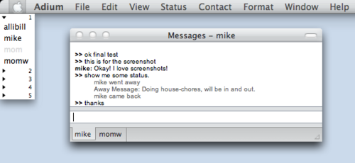
DescriptionEven less decoration than textonly. No time stamps. No link color. No icons. White background, black text, grey status. Arial, but follows GUI. Only shows other person's name, since you already know your own. Try with "Blank" status icons.Finally you can convert your minimalist crank of a friend to Adium. ImagesCommentsYou can reply to individual comments by clicking the "Reply" link next to each. # by Omey on 09/08/05 at 21:25:32This theme would be perfect if I could hover over messages and get time stamp info!
# by josef on 03/06/06 at 23:54:10Hi! I love this style, it's great. I had two questions though... First, would it be possible to edit something so that your own nick shows up instead of it just being >> ? And second, would it be possible to make the links not create a horizontal scroll when they're too long for the window? Not a big problem, but just a tad annoying..
Post a New CommentYou must be logged in to post comments. |


# by mathuaerknedam on 09/08/05 at 10:47:34
# by gethen on 11/30/05 at 03:07:49
I actually made this theme upon request from a friend who complained bitterly about the lack of "good IM clients" for Mac. By creating this and "blank" (status icon theme, or rather lack of theme), I convinced him that Adium did in fact fit his needs quite perfectly. I put it up here with the thought that there might be another person out there like him (and in fact a number of friends, former and current linux geeks with new mac minis, mostly, have come to use and love it, so that worked out).
# by mathuaerknedam on 11/30/05 at 11:28:39