|
|
iBubble 1.3 |
| Submitted By Iiro Jäppinen (Iiro) |
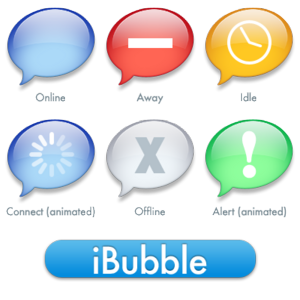
DescriptionIt includes yellow icon for idle state and red icon for away stateOkay this is my first icon for Adium so I hope you like it. :-) I'm not sure if it's done before tho.. Any comment/tip/criticism is appreciated. Changes*UPDATE* Updated to 1.3- Changed the Away state color back to Red, I like it more - Got Lazy, Removed the Readme file *UPDATE* Updated to 1.2 - Changed the color of Alert State to Green - Changed the Away state to Yellow - Removed the 1p stroke from all the bubbled, added a soft glow - Added a blue shade to the Base State, added a "big fat X" *UPDATE* I updated to version 1.1 ImagesCommentsYou can reply to individual comments by clicking the "Reply" link next to each. # by Alex on 07/28/05 at 21:34:55Beautiful :) My only suggestion would be to add colours to the away and idle bubbles to make those states stand out more.
# by cshbell on 08/23/05 at 13:40:05I've seen and used many dock icons, but this one is by far the most professional and polished of them all. I'd STRONGLY encourage the developers to consider using this as the default dock icon. Adiumy is cute and all, but let's grow up a bit, shall we? Great work all around.
# by fortyseventeen on 11/06/06 at 14:05:31Heh, pretty old post to reply to, but...
Good idea, but I don't think they want to risk copyright infringement, since it resembles iChat's icon pretty closely. # by gabrielradic on 08/27/05 at 16:42:33The graphics in this icons set are gorgeous. I also believe they are the best out there, and would recommend using them as default, if the author allows for it.
Here are a few suggestion for improvement: - Away icon in Orange. The way it is now - Red with dash - it looks like an error. A gorgeous, lickable, and confusing error :-) - Make the new message (alert?) icon Green. It makes sense. - Put a big fat X on the Gray Disconnected icon. Thank you. # by Iiro on 08/28/05 at 02:02:33I'd be honored to have my icon as the Adium's default icon :-)
And gabrirelradic, I'll make those changes you you suggested and see if it's nice. Thanks. And thanks for all the positive feedback! :-) # by eLahraiRaH on 08/29/05 at 09:13:10I think I prefer the Away icon in red. It looks more like a standard No-Entry sign. I see it most when I set my status to Busy. And a no-entry sign is more in keeping with the message I want to send to my contacts when I set my status to Busy (That I would not like to be messaged). And the red dock icon is a good visual reminder of this.
Yellow is a good corresponding colour for Away. But I treat Away to mean Busy in all but name. I don't know, but perhaps it is possible to create a seperate red icon for Busy status and a yellow icon for Away? # by MeDiCiNe on 08/29/05 at 14:11:00This is simply the best dock icon for adium. Kill the duck loving the bubble.
# by lurkingrue on 08/30/05 at 14:02:25Please return to the red "away" icon -- the yellow is more appropriate for an intermediate state, such as "idle"...
# by ascarinthesky510 on 09/05/05 at 14:52:04Wow, I remember using this before and not liking it very much, but it looks great now!
# by gabrielradic on 09/12/05 at 16:27:56Iiro, thanks for being so responsive. This great stuff.
PS: I'll send an ER for a Busy status right now. # by budoink on 09/27/05 at 16:50:11I agree with the previous statements that this is the best and most professional icon Ive seen for adium, it would make a great default icon, but we can never loose the duck really can we!?!
...but yeah ...keep up the fantastic work gabrielradic! # by cshbell on 10/17/05 at 09:03:43Would it be possible to make the default application icon for Adium the blue bubble instead of the gray "offline" bubble? Otherwise, as I've said before... HAMAZING!
# by gethen on 11/26/05 at 19:00:45wonderful icons. large, clear, and make total sense. you can see if you've left yourself away at a glance, whether you're just away or both idle and away, and the animated login state is so useful! with many dock icons i was not sure whether i'd begun logging in or not (one computer is set up to autologin, the other is not). this is the peak of usability, and I hope whatever the author does to it in the future, that this version remains around for use. as a bonus, when a visitor uses my computer, they no longer have to wonder which icon goes to the chat program!
# by Iiro on 12/07/05 at 11:09:13I'll keep the grey one as the base icon, because then you can see if it's online or not. However, I migh think about remowing the X, but if it doesn't really bother anyone, I'll keep it cause I like it personally. :-) Thanks all for the great comments
# by Mohawk on 04/27/06 at 01:34:57I think it'd be better without the X for the offline icon, its been my only problem with this icon set, apart for that I love using it, looks fantastic.
Keep up the awesome work! # by jzenker on 06/19/06 at 17:17:20Your icons are fantastic. I never much liked the Adiumy ducks, and these are so sleek and understated. I do have one request. Please increase the duration of the white flash in the dock icon when a message is received. Right now it seems too brief. (See the speed of the flash in the Adiumy icons for a reference.)
Post a New CommentYou must be logged in to post comments. |


# by eLahraiRaH on 07/25/05 at 14:00:50