|
Discii |
| Submitted By Ian LaForge (ianlafo) |
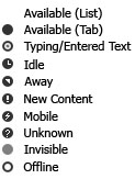
DescriptionUsing the status icons from ancient versions of Adium as inspiration, this status icon pack is perfect for those who just want something clean, simple, and neat in their contact list.ChangesNew in 2.0New Mobile icon New Unknown Status icon All icons have been redrawn for (hopefully) improved appearance Images   CommentsYou can reply to individual comments by clicking the "Reply" link next to each. # by mathuaerknedam on 07/25/05 at 15:47:43Noticed that the preview is missing the icon for mobile, and that some icons are wider than others, causing odd shifts in an otherwise aligned contact list.
# by ianlafo on 07/25/05 at 16:03:11I'm greatly discouraged to hear that. I was certain that all icons were the same exact size, but I missed the mobile one (since that was the one I was unable to test).
I'm uploading a new version now, and hopefully it should fix the problem, if not, drop me an eMail. Thanks. # by on 07/25/05 at 23:17:42The alignment looks fine except that the 'Available' icon appears to have disappeared.
# by ianlafo on 07/26/05 at 01:41:21Actually, and I know this isn't made terribly clear from the screenshots, but there is no available icon for the contact list, only in the message window tabs.
In the older versions of Adium, there wasn't an icon for available in the contact list, and I liked it that way a lot. If there's a huge demand for it, I might add one in for the contact list; but as of now, there aren't any plans to add one in. I'm sorry about that, and if you really, really want a version with an available icon in the contact list, eMail me and I can supply you with one. # by ktml on 07/26/05 at 20:42:00Nice work. I like the icons a lot. And I like how the Available status without an icon, good idea. But there is one thing about the icq away status though, there is no icon for that and left margin as well... I am not sure if it's intentional or not. Fine with msn away status.
# by on 07/26/05 at 22:32:47Nice. May or may not replace modified modified Seph status icons, but I'll give 'em a try.
# by mathuaerknedam on 07/29/05 at 12:08:26Okay, it took a while to check because I had to wait for someone to go mobile (I eventually had to ask him to). It works!
# by mathuaerknedam on 08/02/05 at 11:41:10I noticed that the status icons ride a little lower on the tabs than the hover close icon. Would they look better centered in the area of the (larger) close icons? (I have to admit, it only bothers me a little bit to see them lower, and I don't see them often because I don't usually close tabs with the mouse. I like height they are now but if they were a couple of pixels higher I might like them just as much for normal use, and like them more when I use the mouse!)
# by mathuaerknedam on 08/10/05 at 13:36:29Could you add (I know, I'm sorry to be so demanding) disk-style icons for mobile and typing?
# by mathuaerknedam on 08/10/05 at 13:47:50It would also be nice if you could make an inverted version, where the icons are a light grey rather than a dark grey.
# by ianlafo on 08/10/05 at 15:40:48I'm working on the mobile icon, it's being a tiny bit difficult, as for the lighter gray icons, I might do those a bit later, but not the highest priority to be honest. I'm working on getting this version to work perfectly, then I'll work on getting newer colors and whatnot.
# by telic.detour on 08/27/05 at 00:16:56I agree with mathuaer -- the tab are spaced a little wierd. Some padding needs to be added so that they will be centered on the close button. Also, the typing icon stands out a little too much... how about a copy of the offline icon with one of the typing dots pasted into the middle instead? Overall, a very good icon set though! Perfect for small-sized contact lists!
# by Dylan1077 on 10/16/05 at 22:38:23Yeah there needs to be an available icon, would look much better.
# by sarahmonster on 06/28/06 at 14:20:32This status icon set makes me unable to select status types from the drop-down menu while creating custom statuses. I've tested and if I switch to other sets, I can do it. Not sure what's the problem there, but I like this set so much I'm willing to go to the trouble to switch to a different set when I create custom statuses and then switch back. I really appreciate the lack of "available" icons, it makes the other statuses stand out so I can more easily tell who's away/idle/etc.
# by ianlafo on 06/28/06 at 18:40:51I'm using the current version of 0.89.1, and I cannot seem to reproduce your problem. I also cannot reproduce the problem in the 1.0 svn build. Maybe you could take a screenshot and email it to me (ianlafo@gmail.com)? I can't possibly think of what would be causing the problem, but if I can find a way to see what's going on, or reproduce it, it'll be easier for me to look into.
Thanks for the otherwise positive comment, though! # by fissure on 08/06/06 at 03:26:29Very nice work! I do prefer having something there for available, and I hate it how the mobile doesn't really match the others, but it was simple enough to modify it to how I prefer :)
# by benjamindaines on 10/07/06 at 14:38:11I like this a LOT, but can you make the typing and "ZOMG THERE'S A NEW MESSAGE" icons pulse?
--Cheers and keep up the great work! Post a New CommentYou must be logged in to post comments. |


# by mathuaerknedam on 07/25/05 at 14:52:40