|
Terminal Message View |
| Submitted By Takumi Murayama (zaudragon) |
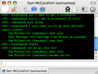
DescriptionI always liked the way Terminal looked, so I made a message style based upon it. Here it is!Timestamps show up when you hover over the message. This uses the style of the default bash or tcsh shell, with different colour variants (Green on Black, White on Black, Black on White). You can always edit it if you like. Note: I changed the status messages to be formatted like this: bash: First Last went status or tcsh: First Last went status Changes1.1: Fixed the History problem with half of the last message being cut-off. This even got disabled for that reason :P1.2: Added tcsh variant! Thanks reikon! 1.3: FINALLY got the bug I thought I squashed in 1.1 fixed. YAY! 1.4: Added white text variants. 1.5: Eh got a better way to fix the bug. 1.6: Added black text variants, moved some code around to ease updating. Apparently I also changed the font to Monaco 9. ImagesCommentsYou can reply to individual comments by clicking the "Reply" link next to each. # by oddfellow on 06/29/05 at 15:53:04I think the text in the header should just be on top of the regular html instead... it interacts strangely with the conversation text, for me anyway.
Great style idea, though! I'm fixing it up a bit for my own tastes, but overall I love it # by oddfellow on 06/29/05 at 16:03:06I take back what I said about having issues with the header. It seems to work just fine now. Hooray.
# by zaudragon on 06/30/05 at 10:21:56The header is perfectly fine as long as the chat name/contact name doesnt wrap to a new line.
# by on 06/30/05 at 15:55:44Any chance of alia's showing up in the chat window? I tell it to display alias of the buddy I'm chatting with but it never shows.
# by zaudragon on 07/10/05 at 11:50:23Corey: What version of Adium and OS X?
Adium 0.8x is required and it wont work on Jaguar, and maybe not Panther. # by zaudragon on 07/13/05 at 21:24:47chris: Aliases? Have you ever seen "Takumi Murayama" (my long name), or your long name, in a Terminal window? I think not.
To those white-writing supporters: Sure! If I get 3 more votes, Ill put it into the style. Not enough people. # by kermit on 07/14/05 at 09:47:23hey, I like this theme. No of people at my office notice I am chatting:D
# by carvas on 07/14/05 at 14:18:13how can i make the user names/alias to show up? i only got the emails showing...
# by on 07/19/05 at 21:20:00for some reason...my text shows up as black. but chatting partner's is green and all...but mine is...black. So I can't read it. So, that's a bummer.
# by zaudragon on 07/19/05 at 23:03:11mike: Set it as green. Or, edit the CSS to make the background white.
# by travcook on 08/09/05 at 06:24:29When I have the header showing, it cuts off the text, like doesn't show the latest line... and I really like the header too.. without it it's just boring..
Got a fix? :-) # by zaudragon on 08/10/05 at 20:24:29travcook: If your header wraps to a new line, it does that. Enlarge your window to fix it. Ive had the same problem with wrapping, but without, it works perfectly.
# by Koba on 08/21/05 at 20:31:19i third the white text, with some more features, and other nifty things, this could just be the best message window style ever!
# by travcook on 09/01/05 at 01:15:21Thanks zaudragon, I eventually figured this one out ;-). Now I have a very big chat window. Heh heh heh...
# by JBHoren on 09/23/05 at 17:27:57YESH! As a veteran (17 years) Unix sysadmin, I saw this message-view design and had to have it. Thanks!!
# by ourlastgoodbye on 10/02/05 at 16:29:52Is there any way...
1. Make their Alias name appear? 2. Make the text white? # by zaudragon on 10/02/05 at 19:48:551. No, that is already established. You do NOT normally see Takumi Murayama (my name) in the Terminal, instead you see the short user name, which we is the same as the screenname essentially. Look in the tab/titlebar instead; not too hard. I especially like it this way because sometimes, MSN users have obnoxiously long display names.
2. Enough people asked. I shall do it today it might take a while to approve though. # by Yukio on 10/05/05 at 14:31:06Hey ,
This terminal style....is very sweet....nice job... I like it...you get the feeling you typing a so called "Matrix" code into your chat window... # by ourlastgoodbye on 10/05/05 at 21:16:56When I have the header on and am the first to send a message, it does not appear until my friend responds.
Also, when the header is off, my first messages to my buddies are halfway cut off at the top so they are unreadable. Thanks. # by osprey54 on 10/07/05 at 04:00:49is there any way to make it so you can chose your own background and text colors?
# by OxC0FFEE on 10/10/05 at 20:37:16I love the style, but I'd love it even better if it supported timestamps. Think you could massage them in without breaking the tcsh/bash metaphor too badly?
# by aphrospice on 06/12/06 at 04:49:42Thank you. Something for the geeky girls like me to sink their teeth in.
# by prometheus on 06/13/06 at 21:45:24I like this one alot because it's easy to but a background image behind plus is very simple. Thanks alot!
# by cynic on 10/28/06 at 02:43:29you're trying to confuse me! Before I know it I'll be putting commands into adium and wondering why terminal is quacking!
Post a New CommentYou must be logged in to post comments. |
|
||||||||


# by on 06/27/05 at 02:22:44